Design comparison
SolutionDesign
Community feedback
- @doganfurkanPosted over 1 year ago
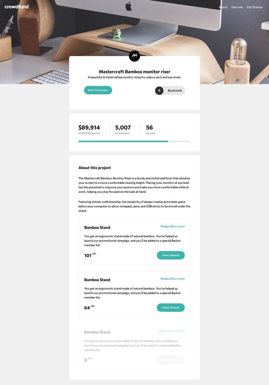
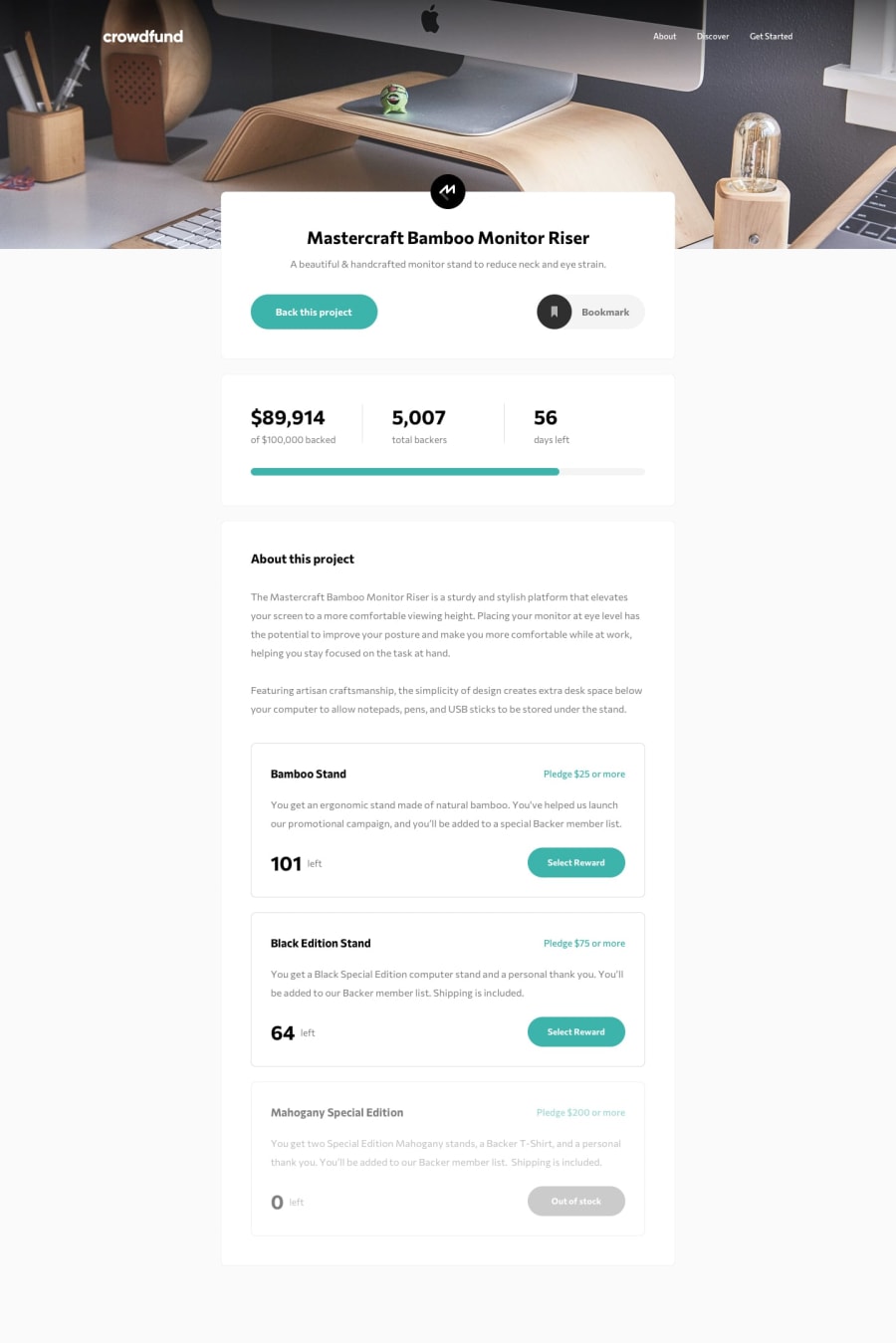
Hey, congrats! This is a very good job. I want to help you with one thing, though: Your "Bookmark" button. Your icon there isn't aligned with the button.
- For the bookmark button; remove the padding, and set justify-content to "space-between".
- For ".divIcon", get rid of the absolute positioning.
- For the icon image; set the margin to 0 and "vertical-align" to "bottom".
- Set "align-items: center" for Btnbookmark div because it messes up the height of your bookmark button
- And lastly, for bookmarkText div; set flex-grow to 1 and justify-content to center.
I think these will solve the issue. And again, good job!
Marked as helpful0
Please log in to post a comment
Log in with GitHubJoin our Discord community
Join thousands of Frontend Mentor community members taking the challenges, sharing resources, helping each other, and chatting about all things front-end!
Join our Discord
