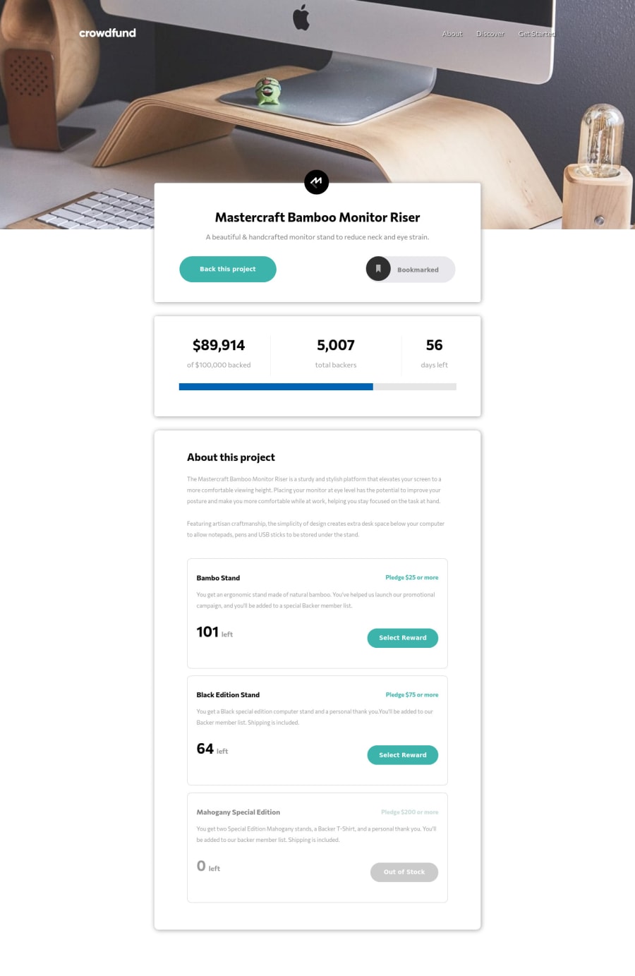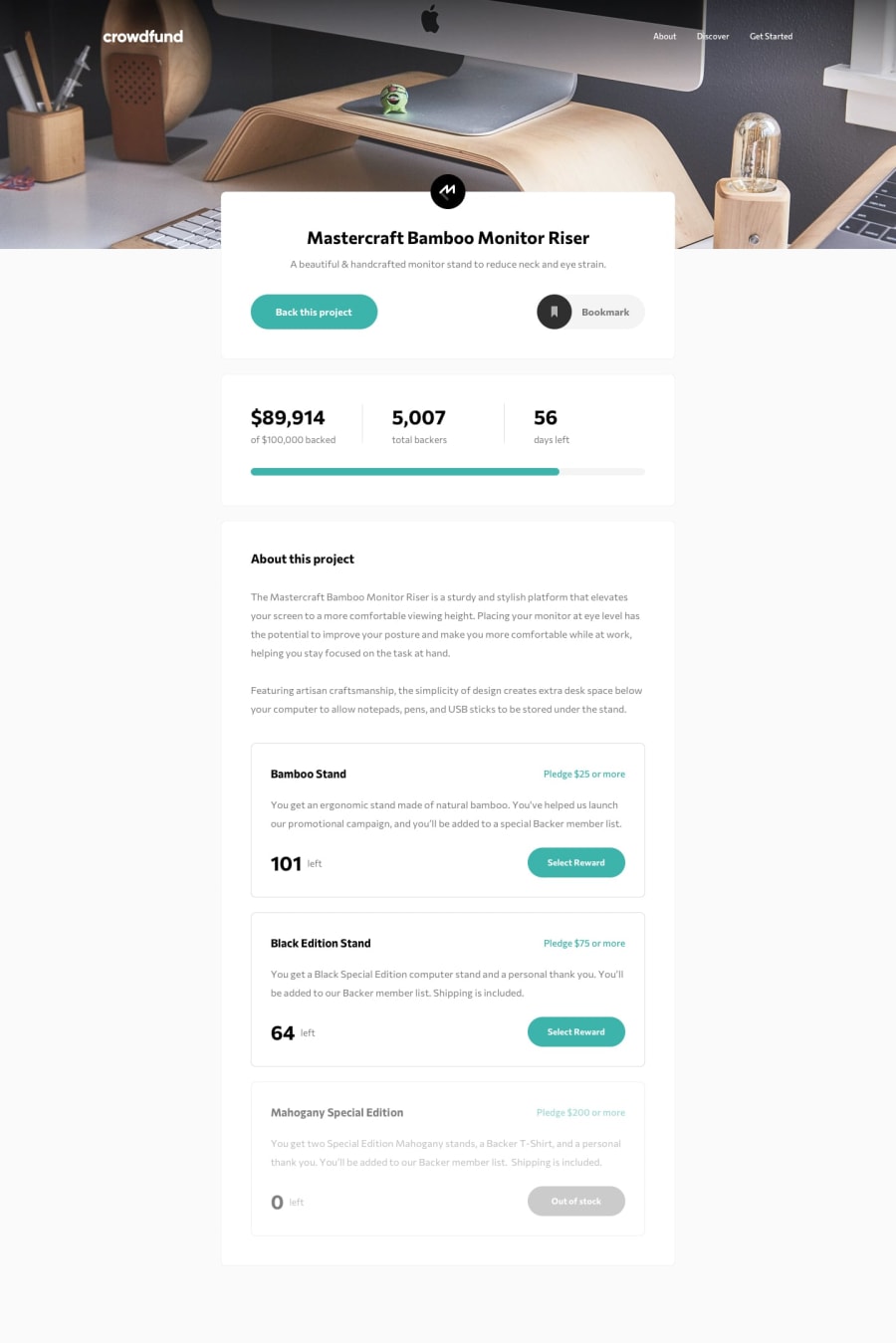
Design comparison
Solution retrospective
Wow! This was took me a while! But I'm proud of myself with the end result eventhough is not perfect! I learned a couple of new things and refresh on other that I have forgotten. Any feedback is appreciated! Regards.
Community feedback
- @ThePartnerDeveloperPosted about 2 years ago
Hi, Oscar!
You should be proud of yourself, and great job making your website very accessible by using REM and alt tags. I would suggest looking at the following to help improve your code and make sure it's even more accessible in the future.
The first topic I'd like to touch on is the line-height, you declared them in pixels, yet your font-sizes are in rems. If the user has changed their font-size in their browser settings, lets say to 2x the normal size (16 pixels), that would make their font-size 32 pixels. With a line height that is set at 25 pixels, the lines of text would be overlapping by 7 pixels. Instead, I would use the REM unit as well for line-height.
Another way to make using REM easier would be to do the following. If you set the html font-size to 62.5 percent, that is equal to 10 pixels. Whenever you use the REM unit, it is calling from the html root size which now is 62.5 percent. Let's say you want to set a h1 size to 36 pixels, now all you have to do is set the h1 size to 3.6rem instead of 2.25rem, allowing for easier calculation on what rem size you need.
html {
    font-size: 62.5%;
}
Another area for improvement would be to look at smaller screen sizes. When I make my screen size 540px X 733px, it is impossible to see the exit button on the "back this project" menu.
That's all I found at a quick glance! Good luck with your future projects and endeavorers!
0
Please log in to post a comment
Log in with GitHubJoin our Discord community
Join thousands of Frontend Mentor community members taking the challenges, sharing resources, helping each other, and chatting about all things front-end!
Join our Discord
