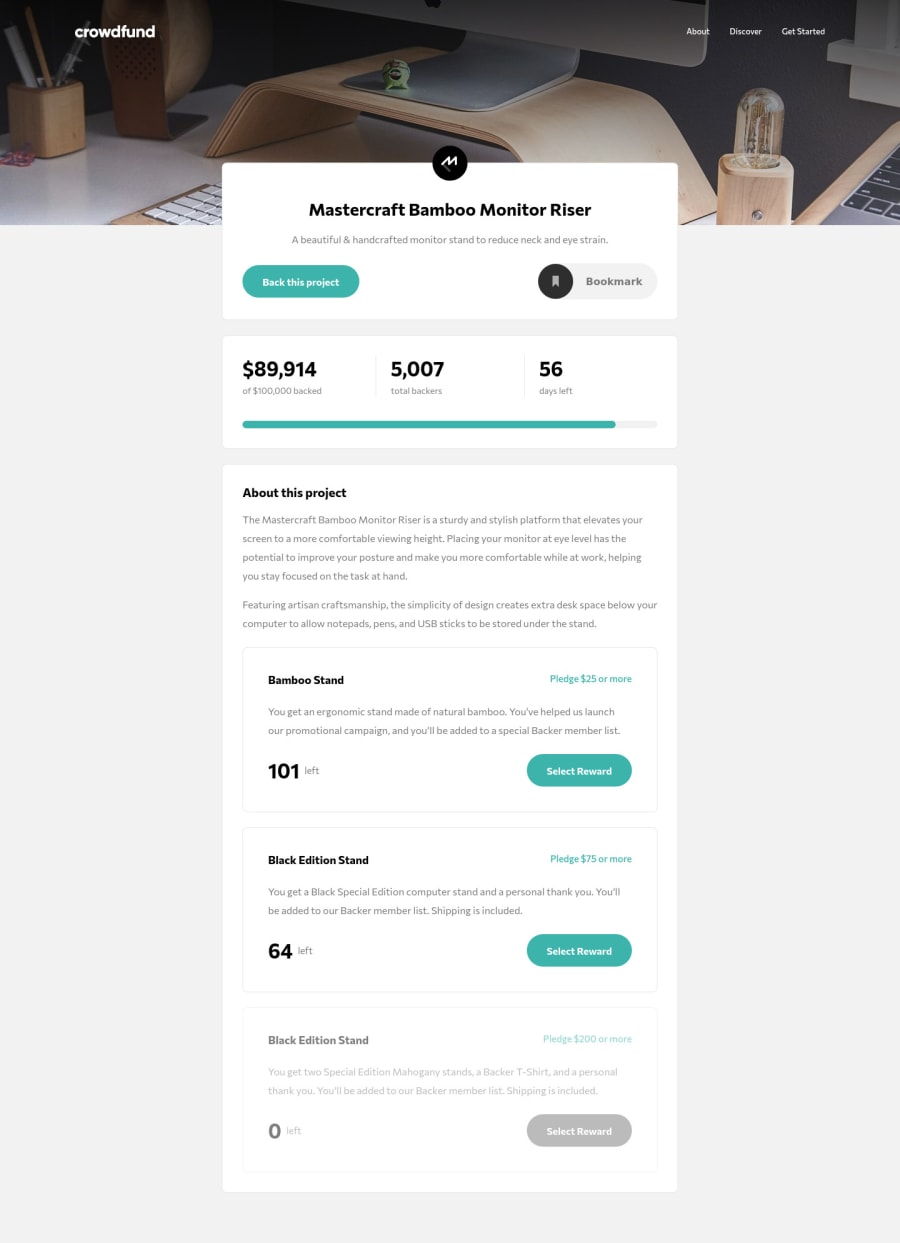
Design comparison
Solution retrospective
This was one of the most difficult projects I've worked on so far, but I'm proud of having finished it.
I decided to build it with just vanilla JS which was challenging but also fun. One of the things I've learned about was the MVC pattern which I tried implementing on my own. I'd be grateful for feedback on my implementation!
Another tricky part was the navigation. My goal was to disable scrolling on the rest of the page when the mobile nav is opened, which I achieved by adding a class that sets overflow: hidden on the body. The problem is that when the mobile nav is opened and then the viewport width is increased, that class remains on the body and therefore the user can't scroll down to view the rest of the page. Again, I'd be grateful for any suggestions on how to solve this problem or how to implement it in a better way.
Community feedback
Please log in to post a comment
Log in with GitHubJoin our Discord community
Join thousands of Frontend Mentor community members taking the challenges, sharing resources, helping each other, and chatting about all things front-end!
Join our Discord
