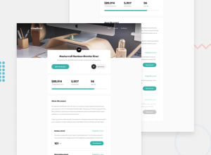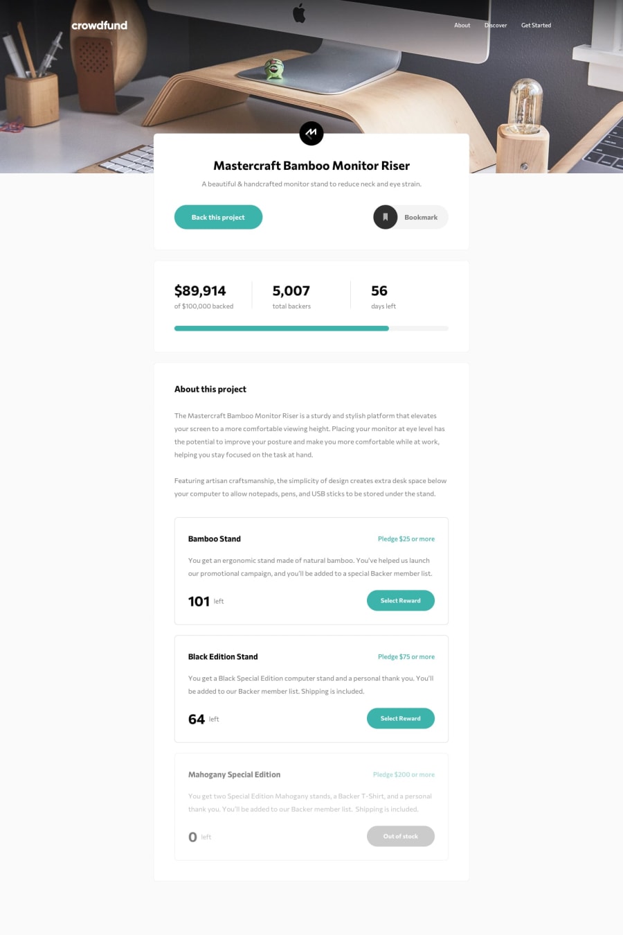
Crowdfunding product page with Html Css Vanilla JS
Design comparison
Solution retrospective
hey guys ;) it took me a lot of time to finish this challenge, my code was a mess. im waiting your feedbacks ;)
Community feedback
- @mbart13Posted over 3 years ago
hello,
looks good, but part of this challenge was also state management, so progress bar and total money raised should increase after pledge, I didn't observe that in your app.
also, on larger screens (> 1440px) there are white margins on both sides, which are not in design
anyway, this is definitely not an easy challenge and you did good ;)
1@Dark-LoverPosted over 3 years agothank you @mbart13 for your feedback iv worked only on (1440px), i didnt pay attention to wide screen view. the progress bar was static because im focusing on html css side, my js skills aren't good enough. thank you again
0
Please log in to post a comment
Log in with GitHubJoin our Discord community
Join thousands of Frontend Mentor community members taking the challenges, sharing resources, helping each other, and chatting about all things front-end!
Join our Discord
