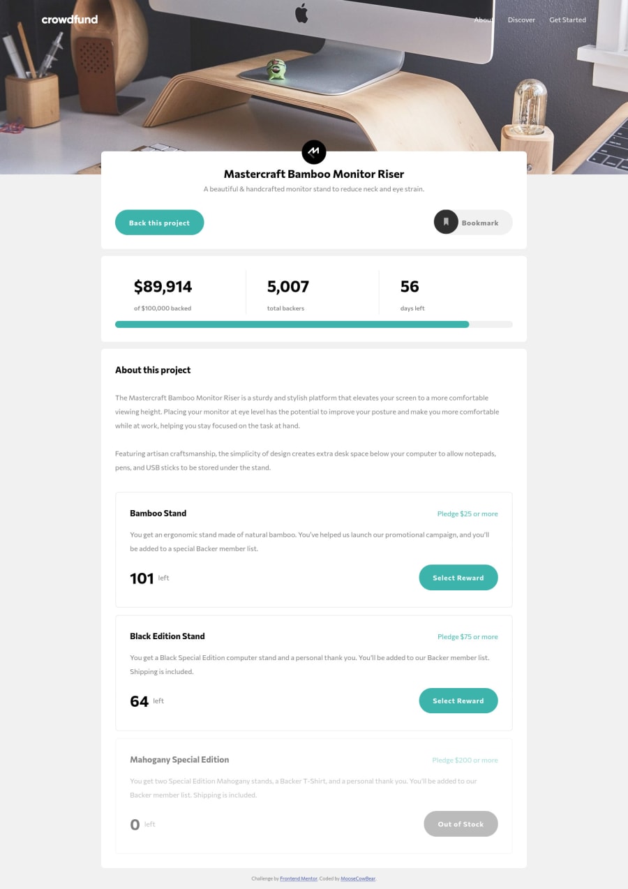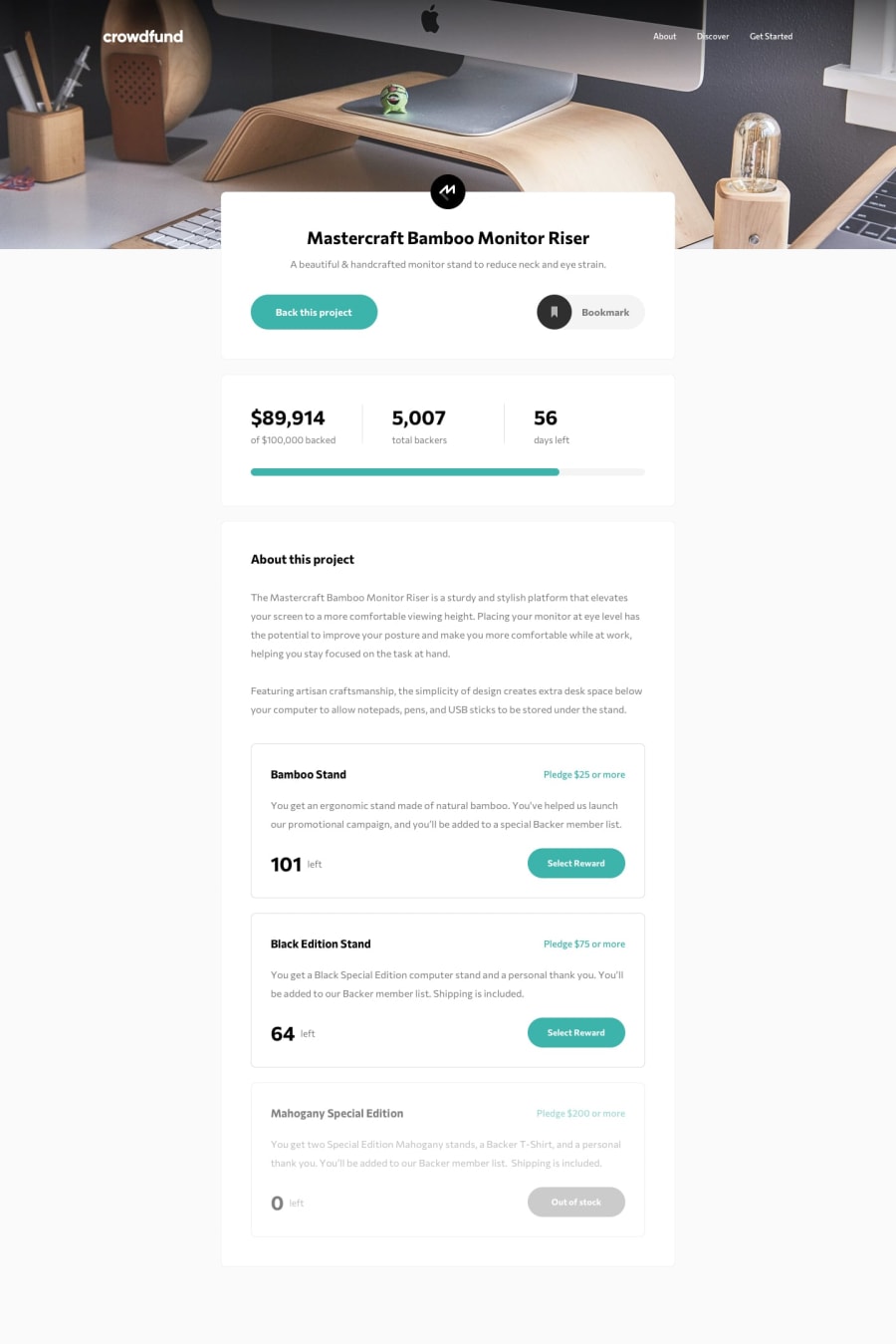
Design comparison
Solution retrospective
This one gave me a bit of trouble. I couldn't manage to get the "X" icon for the selection modal to darken when hovering. Usually I would apply a filter but that didn't seem to change the color. I also tried inserting the image between svg tags (instead of using an img tag) and then trying to set the opacity (since the fill color was black and the opacity was originally 0.4) and that didn't work either.
Does anyone know what does work? Thank you.
Community feedback
- @magdanoldePosted over 1 year ago
Hi,
unfortunately I don't know the answer to your question, as I havent even realized that this feature was a part of the project :S However I had a look at it and on the desktop view the second "scheme" box ("Black edition") has a different size vs. the others. It applies also to the modal. I checked you code but I couldnt find out what the reason was. Other than that, I think it looks great!! Congrats! it wasnt an easy project.
Cheers, Magda
0@MooseCowBearPosted over 1 year ago@magdanolde Thanks for the feedback.
By scheme box, do you mean it looks like that section looks wider than the others? Does it look like the content is off, or the border, or both? I'm asking because on the browsers I have I can't see a difference.
Also do you mind sharing what browser you're using? I'm wondering if my resets are not as comprehensive as I'd like.
0
Please log in to post a comment
Log in with GitHubJoin our Discord community
Join thousands of Frontend Mentor community members taking the challenges, sharing resources, helping each other, and chatting about all things front-end!
Join our Discord
