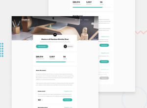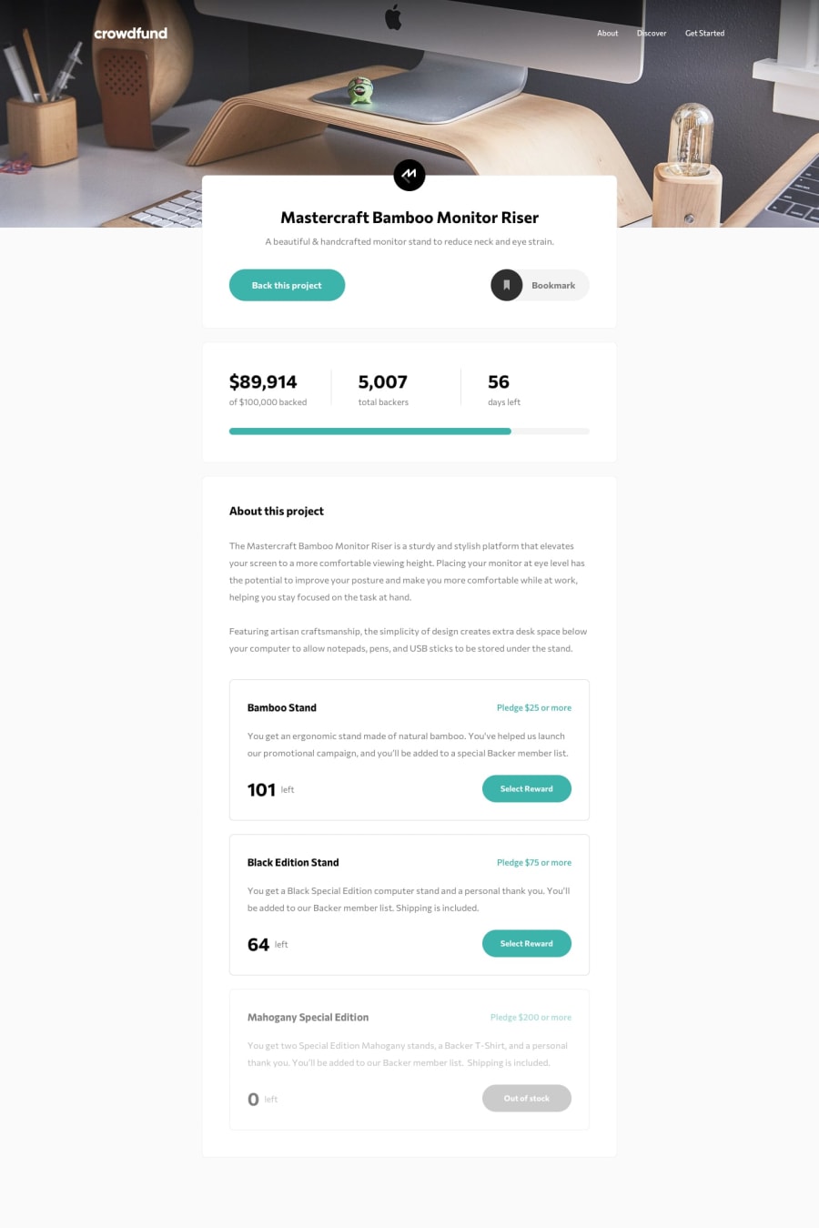
Design comparison
Solution retrospective
I really enjoyed working on this one. It turned out to be more complex than I initially expected, which was great because it provided a good challenge and taught me a lot through the process. I'm pleased with how it turned out.
What challenges did you encounter, and how did you overcome them?I encountered challenges with toggling between pledge options and ensuring the selected pledge was correctly highlighted and displayed. To address this issue, I used the data-target attribute to dynamically manage the visibility of each pledge and maintain the selected state. This approach allowed me to effectively control which pledge was visible and highlighted.
All feedback is welcome. Thank you!
Community feedback
- @haquanqPosted 4 months ago
hi @mkboris,
I took a look at the live site, it looks good but the animation is too much and slow. Consider using simpler and faster animation (200-300ms, event just a 5-10px fade in is good enough)
About functionality, it looks like you didn't handle the situation where users put lower pledge in the input than minimum pledge required. When click
Select Rewardthe modal need to select the option that user clicked on.Keep it up and happy coding!!
Marked as helpful0@mkborisPosted 4 months agoHi, @haquanq! While I don’t think the animation is too much, I agree it could be faster. I’ll adjust it to be quicker. I’m also aware of the issue with handling pledges below the minimum required amount and the modal selection. I’ll make sure to address those as well. Thanks for the feedback🤝
1
Please log in to post a comment
Log in with GitHubJoin our Discord community
Join thousands of Frontend Mentor community members taking the challenges, sharing resources, helping each other, and chatting about all things front-end!
Join our Discord
