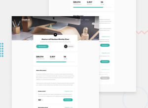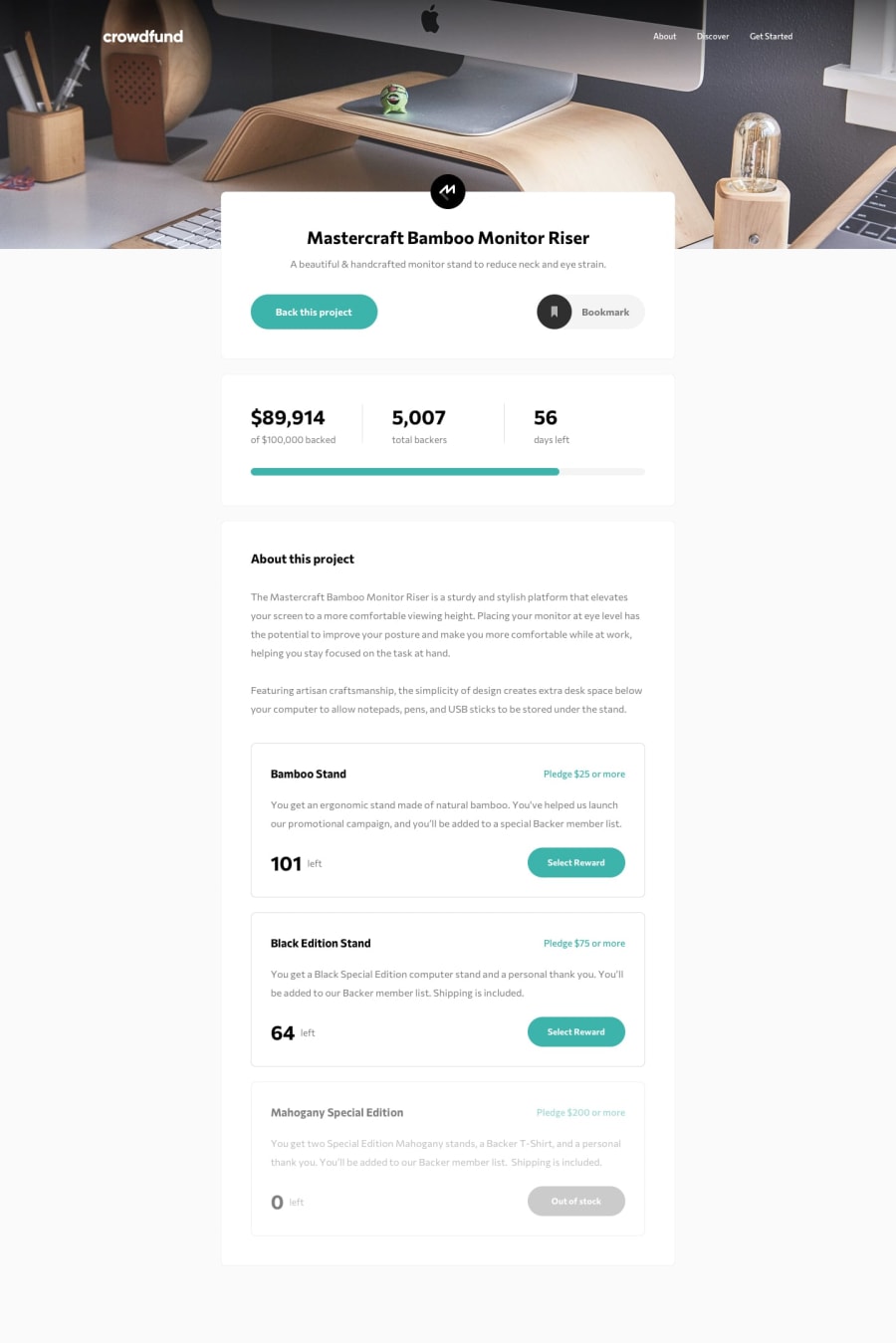
Design comparison
SolutionDesign
Solution retrospective
This was quite an interesting one, it had the same information, the products the user can back, repeated twice one click away from one another, once on the main page and once in the modal, and the design wasn't clear on what the relationship between these two instances are. Hopefully my solution makes sense! I had immense fun building this with Svelte and I'm quite proud of it.
Also, there's a bit of a jump when opening the modal on Chrome but not Firefox, if you can figure out what causes that would be great.
Community feedback
Please log in to post a comment
Log in with GitHubJoin our Discord community
Join thousands of Frontend Mentor community members taking the challenges, sharing resources, helping each other, and chatting about all things front-end!
Join our Discord
