Design comparison
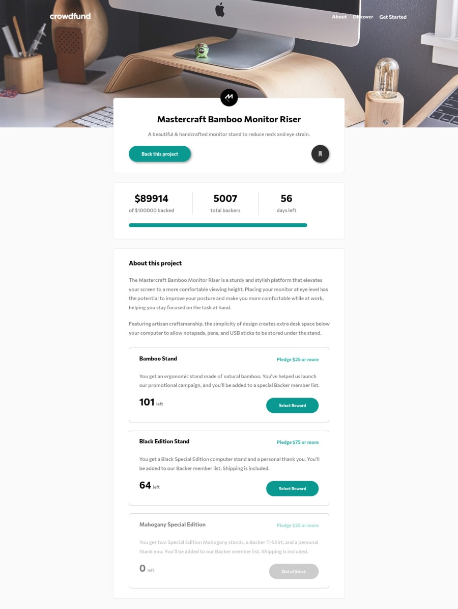
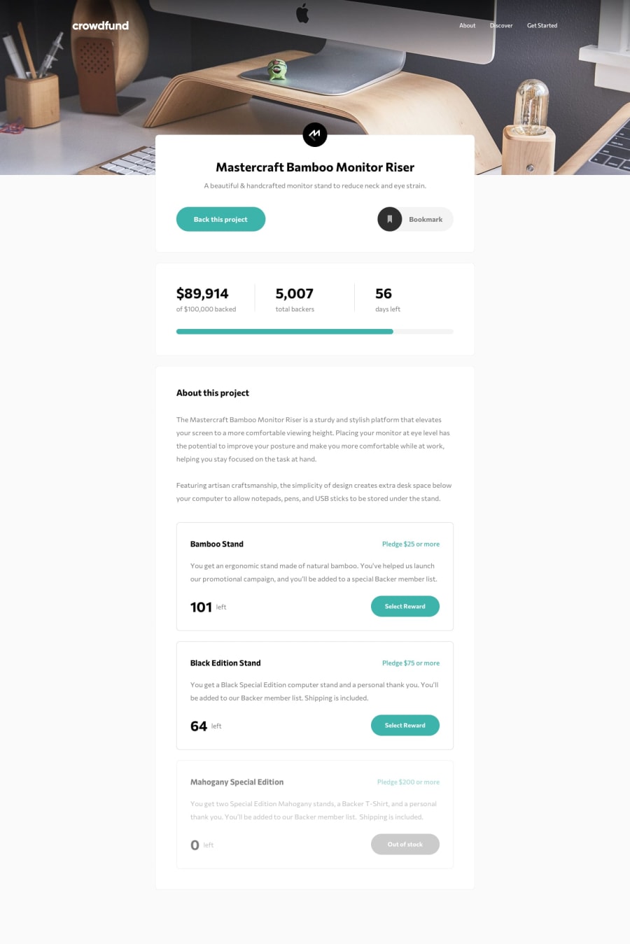
SolutionDesign
Community feedback
- @kamari-1Posted over 3 years ago
Question: how did you make the amount left stay up in full view and come below in mobile view? I've been stuck on this part since and there's not many solutions to this challenge yet.
this part in your code:
<p class="modal-content-back__stand__pledge__text">Enter your pledge</p>0@ArthurGCPosted over 3 years agoFor mobile view, it works in its own position in HTML so It follows the order of HTML. But for desktop view, I used position absolute to position them on the top right corner of the card-pledge.
0@kamari-1Posted over 3 years ago@ArthurGC Thanks. I thought it was some flexbox feature I didn't know about.
0
Please log in to post a comment
Log in with GitHubJoin our Discord community
Join thousands of Frontend Mentor community members taking the challenges, sharing resources, helping each other, and chatting about all things front-end!
Join our Discord
