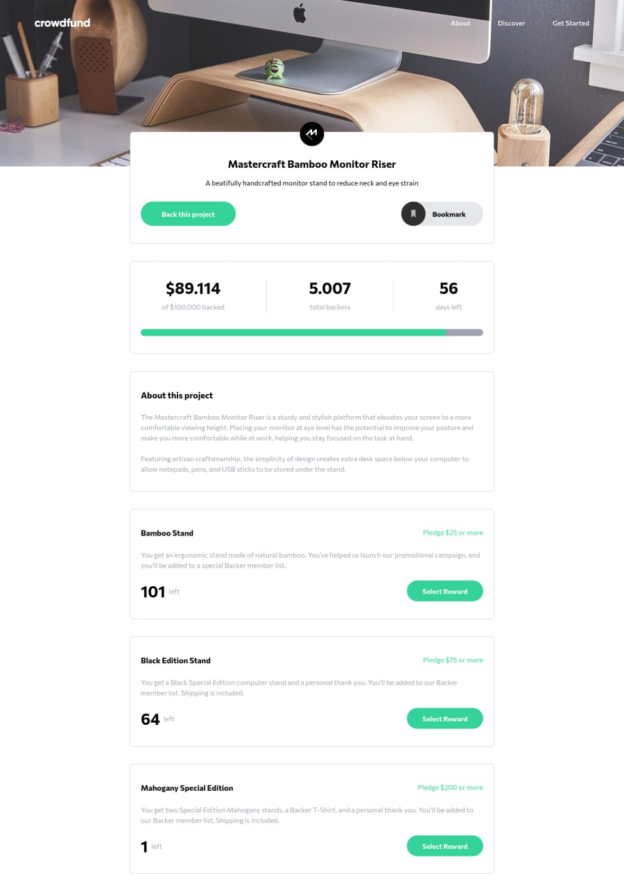
Crowdfunding Product Page | Tailwind CSS & Vanilla Javascript
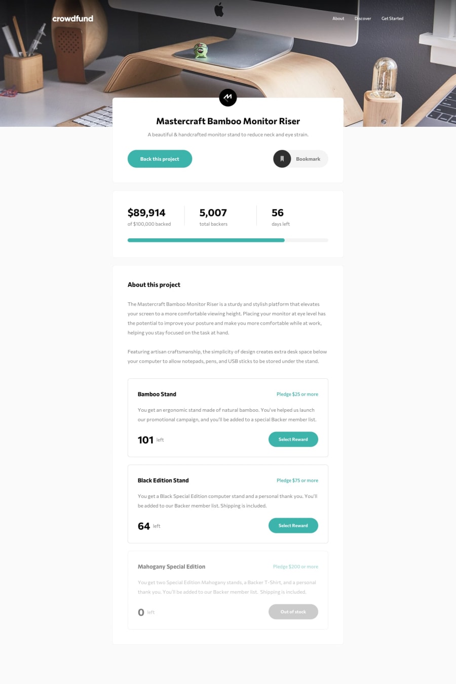
Design comparison
Solution retrospective
any feedback would be helpful :)
thanks!
Community feedback
- @MojtabaMosaviPosted over 3 years ago
Hi, overall you've done great job, regarding you markup the button for hamburgur menu needs a aria-label attribute with descriptive text about what is does, you can also add aria-control to it, I suggest you use border property on the list item instead of hr because it makes you markup more accessible and semantic.
Keep coding :)
Marked as helpful0@jolangkerPosted over 3 years ago@MojtabaMosavi Hi, thanks for your feedback, i dont really understand about WAI-ARIA and how it works and of course for continous development ill start learning about it for semantic purpose.
0 - @saurabhtopthon01Posted over 3 years ago
Add some margin at the bottom of screen.
0@jolangkerPosted over 3 years ago@saurabhtopthon01 ahh i forgot about it.... thanks for pointing that out
0
Please log in to post a comment
Log in with GitHubJoin our Discord community
Join thousands of Frontend Mentor community members taking the challenges, sharing resources, helping each other, and chatting about all things front-end!
Join our Discord
