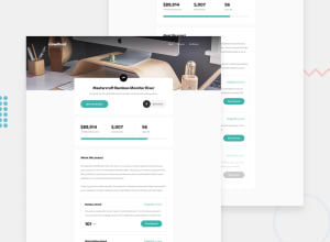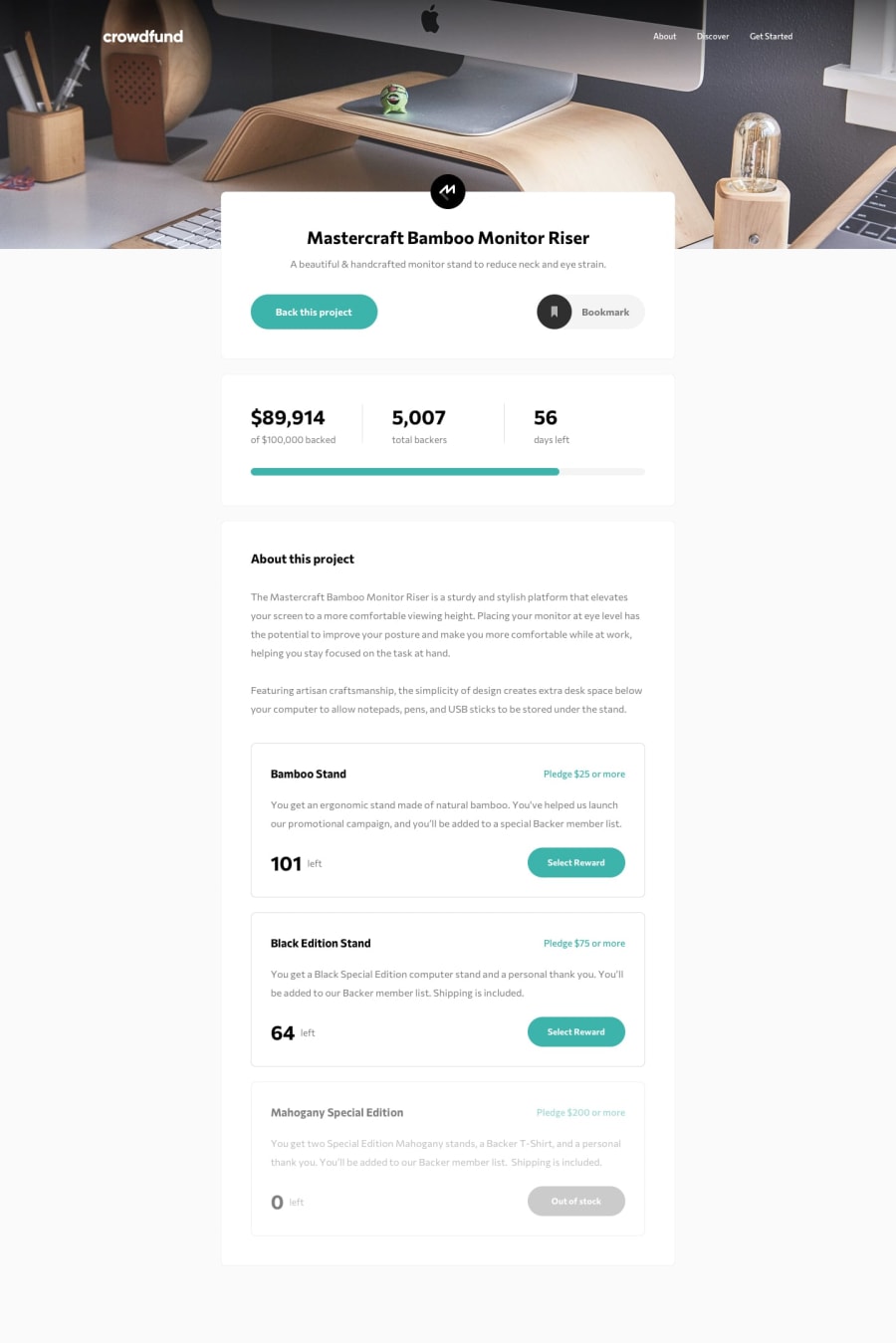
Design comparison
SolutionDesign
Solution retrospective
Yes ik my JS code is very rusty but solution is functional 🥺 I'll learn more and then again try this challenge. Feel free to give me feedback and suggestions on this one. 😄
Community feedback
- Account deleted
Hi,
I think your solution is ok, and does what it's supposed to do but there's some things that need to be looked at;
- When you reach 600px things don't look good for a bit, and then they return when you reach 375px. You should fix that.
- Go to mobile view and then return to desktop while the mobile menu is still active and see what happens... it gets carried over to desktop, resulting in two duplicate navigation links, & I am not sure why you made two separate one's.
Marked as helpful0@thisisharshjainPosted about 3 years ago@thulanigamtee Hello, Thanks for pointing these out. I am fixing them now and will update the solution and live demo asap. Have a great day 😄
0
Please log in to post a comment
Log in with GitHubJoin our Discord community
Join thousands of Frontend Mentor community members taking the challenges, sharing resources, helping each other, and chatting about all things front-end!
Join our Discord
