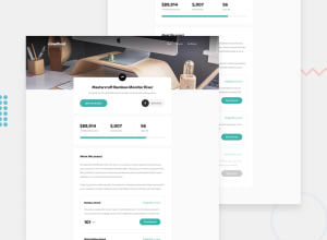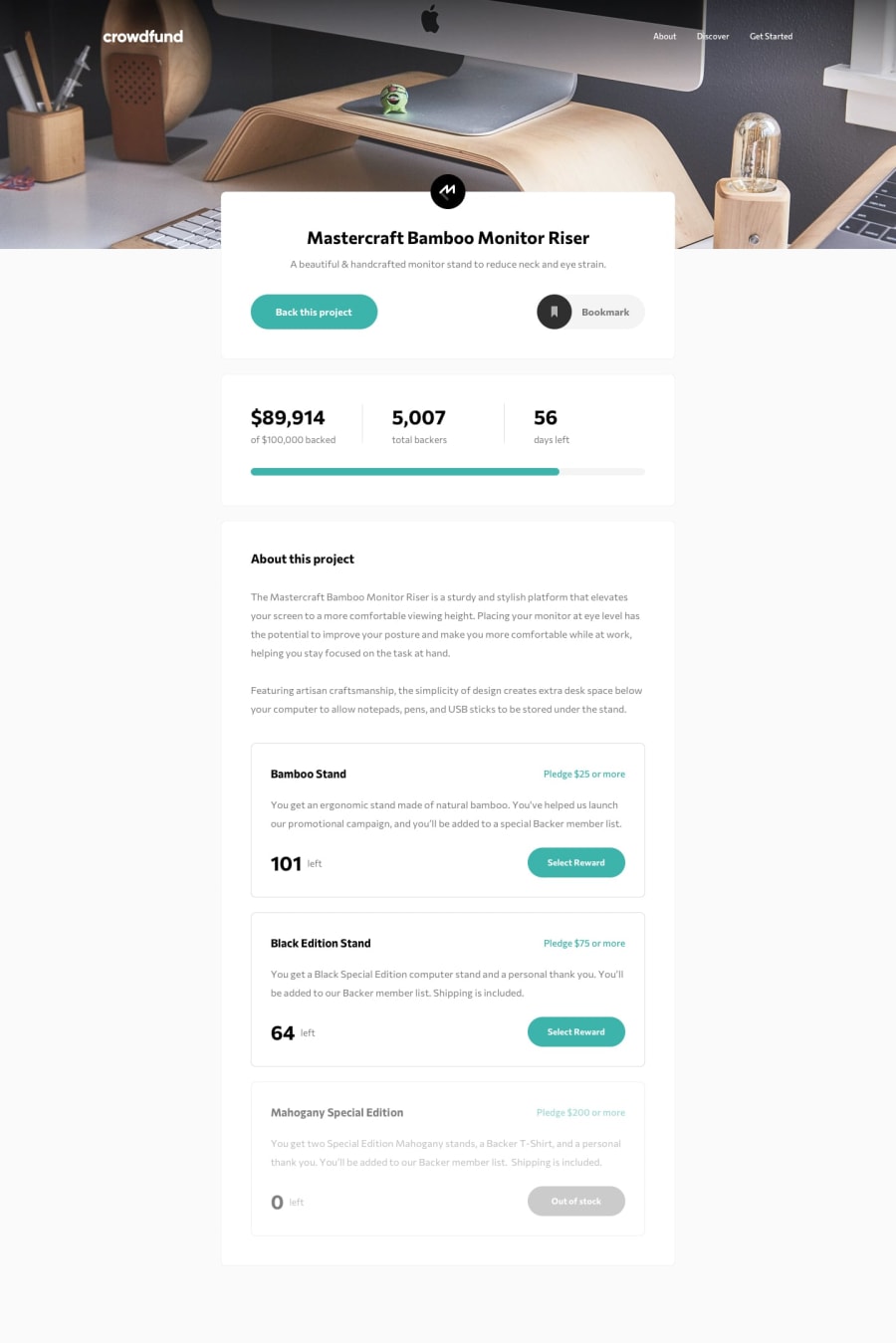
Design comparison
Solution retrospective
The most difficult part of this was definitely managing state between modals and the main page when submitting pledges and changing the statistics for the project. Transitioning between the modals was also challenging, as well as organizing the components effectively. At one point, I had 3 different versions of both of my modals made because I initially call them inside of the button component that triggers them open.
I opted to use the Context API to handle the quantity state, and frankly, it was somewhat out of laziness because prop-drilling the values and functions to update them down would have been tedious. The only downside I could see to that approach is performance, but this is pretty lightweight as a website overall so I'm not worried about that aspect.
In terms of feedback, I'd like any on React.js best practices, where I could have potentially refactored for more re-usability, and any layout issues when moving between screen sizes.
Community feedback
- @catherineisonlinePosted almost 2 years ago
Nice! 🙌🏻
I would also add some transitions for active states (when colors change on hover). It creates more interactivity and makes the project looks cooler. Active states can be done on buttons, links, titles which act like links or anything else, you choose.
You can read more about it here, in case you haven’t done much of it: https://www.w3schools.com/css/css3_transitions.asp
IF THIS WAS HELPFUL PLEASE MARK IT AS HELPFUL 🤩
Marked as helpful0@jjvega86Posted almost 2 years ago@catherineisonline Thank you for the feedback! I did active states on a handful of the buttons as directed on the design (just using the ::hover psuedo-selector), but I agree that adding in some transition effects would give it more pizazz :)
0
Please log in to post a comment
Log in with GitHubJoin our Discord community
Join thousands of Frontend Mentor community members taking the challenges, sharing resources, helping each other, and chatting about all things front-end!
Join our Discord
