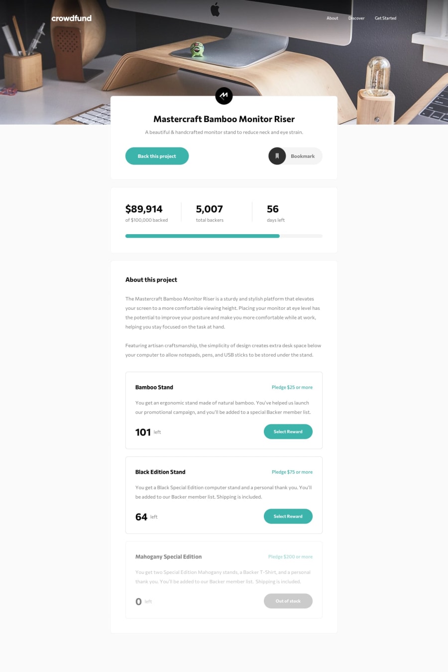
Design comparison
Solution retrospective
This was another fun challenge to work on!
I must say that the responsive design in this challenge was a monster to deal with, but nevertheless I am proud of how it turned out.
One area that I would like to seek advice on is overlay scrolling. When the modal appears, double scrollbars are visible for smaller desktop screens. Not too sure how to get rid of them, ideally I want only one scrollbar to be present. When the modal appears, I want it such that the background stays in place and cannot be scrolled, while the modal can be scrolled if it has too long of a height.
One solution that I tried was to set overflow: hidden when the modal appears, but doing so will cause the background to "jump" to the top if the modal was made to appear at a scroll position that is not the initial. I didn't want to go with this solution as this makes for a more jarring user experience than the ugly double scrollbars.
As always, if there are any areas I could have done better or anyone has a different way of doing a certain thing, they are all welcome!
Community feedback
Please log in to post a comment
Log in with GitHubJoin our Discord community
Join thousands of Frontend Mentor community members taking the challenges, sharing resources, helping each other, and chatting about all things front-end!
Join our Discord
