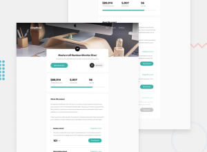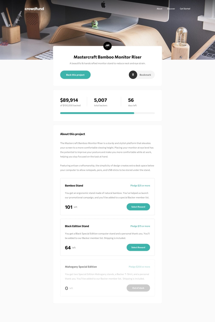
Design comparison
Solution retrospective
This was the most challenging project so far, by far.
I also added to the project that the number of days left updates. I'm also updating the amount of pledges that are left each time a user selects a pledge. As well as updating the button text if none are left (and disabling out of stock buttons using Aria).
What challenges did you encounter, and how did you overcome them?There were many challenges , I struggled for a long time trying to achieve the grayed out background when the popup appears, as well as then disabling the buttons behind the popup (all while remaining accessible) , till I discovered dialog. The bookmark was a challenge, the grayed out background when the menu drops down . There were more, that I will have to add to a README file still.
What specific areas of your project would you like help with?The amounts donated are added dynamically , to make the code more robust, but do not show up in the screenshot for some reason (lag) I guess?
And the bookmark button works just fine when I look at it in github, but it's not visible in the screenshot either for some reason? Same with the progressbar.
Also, I've added the use of a polyfill for dialog, because of potential brouwser issues.
Community feedback
Please log in to post a comment
Log in with GitHubJoin our Discord community
Join thousands of Frontend Mentor community members taking the challenges, sharing resources, helping each other, and chatting about all things front-end!
Join our Discord
