Not Found
Not Found
Not Found
Not Found
Not Found
Not Found
Not Found
Not Found
Not Found
Not Found
Not Found
Not Found
Not Found
Not Found
Not Found
Not Found
Not Found
Not Found
Not Found
Not Found

Submitted

crowdfunding product page

@tushar416

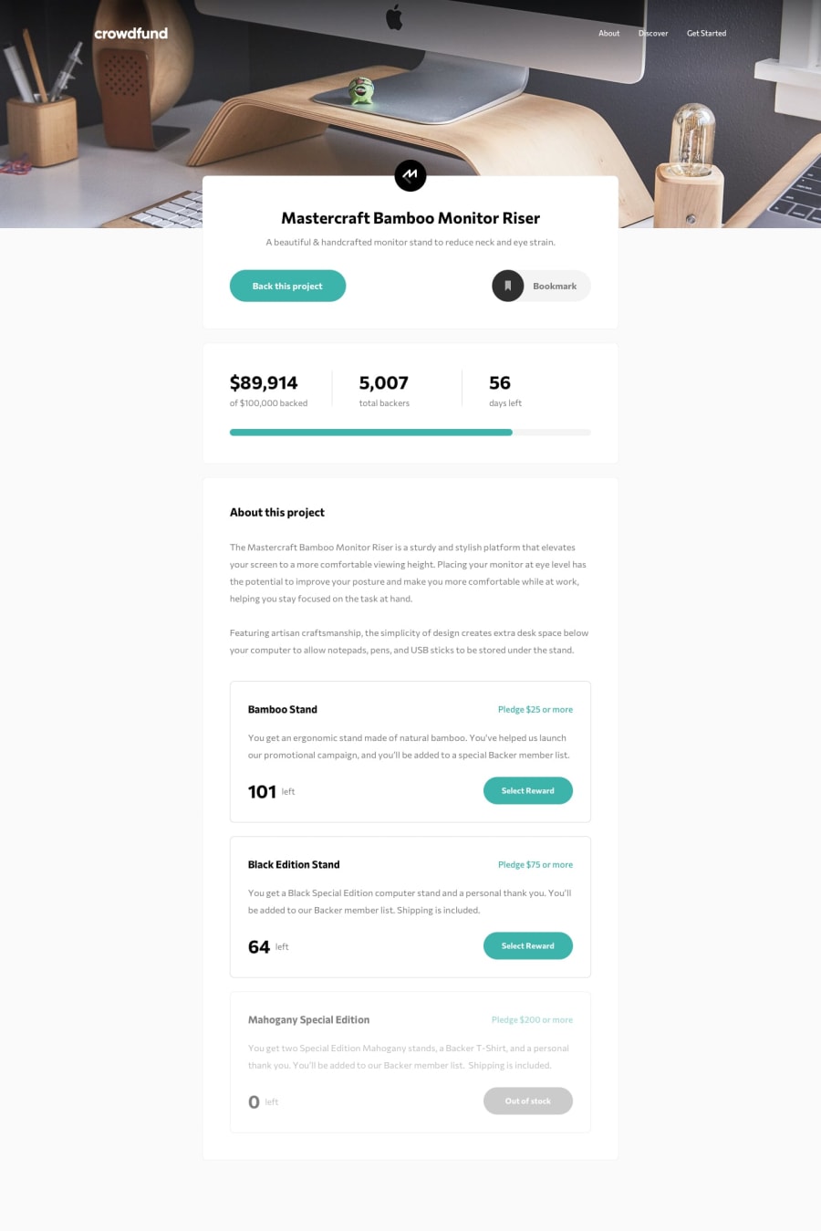
Desktop design screenshot for the Crowdfunding product page coding challenge

This is a solution for...

  • HTML
  • CSS
  • JS
2junior
View challenge

Design comparison


SolutionDesign

Solution retrospective


It was quite an interesting and a bit complicated project. first I don't feel like doing it. I thought I will get stuck and give up, but I got inspiration while watching other's projects. and I got a lot of help from Raymart Pamplona. So I maintain my momentum and did it. I learned different things in it, which made me a bit confident in myself. Thank you for any suggestions or feedback.

Community feedback

@pikapikamart

Posted

Hey, great work on this challenge, the layout is good in desktop and it resizes well when going in mobile state.

The bookmark seems working fine in my end here and that appearance of modal from bottom is a good touch in terms of animation.

My suggestions would be that

  • I think for the select reward buttons, maybe a tags are not the best choice in here since it makes the browser jumps up since it is an anchor tag. But still you can use but maybe adding a preventDefault method on them so that it won't do that such effect.

  • Removing the padding left and padding right of the .head selector in mobile state so that it is aligned to the main padding of the body. Also removing the margin-left in the .logo as well so that they will not be pushed into the right side.

  • Adding a little bit of space in the 101 left in the modal in mobile state. So that it won't be touching the text above it.

Overall, great job on this one and thank you as well for the compliment, really means a lot ^^

1

@tushar416

Posted

@pikamart Thanks for your helpful suggestions. I updated my code. I think it looks better now.

0

@pikapikamart

Posted

@tushar416 @bimalmagar10 That was quick though and thank you for considering it and it looks very good, even before^

1

@tushar416

Posted

@pikamart thank you! 😊👍
0
Roc Tanweer 2,500

@RocTanweer

Posted

Another great work 🙂 @Tushar

I like how your modal is popping up with scale animation and how that bookmark icon suddenly got bigger when clicked.

Suggestions 😃 ;

  1. You main logo seems a bit more to the right on my device.
  2. The custom check box is not working directly, I have to click on the label statement and after clicking, the custom checkbox is not going back to be unchecked.
  3. And also the custom checkbox and label statement are not align in a line on my device.

The second point can be tricky ☺️ but I'll leave it to you. If, by any chance, you are unable to do it then I will gladly help you

Hope it helps and happy coding 😉

1

@tushar416

Posted

@RocTanweer oh! yes I didn't notice it. need some margin and size manipulation for 1 and 3. And for 2 it can be a design preference, but it may look good if it works directly. Thanks for correcting me.

0

Please log in to post a comment

Log in with GitHub
Discord logo

Join our Discord community

Join thousands of Frontend Mentor community members taking the challenges, sharing resources, helping each other, and chatting about all things front-end!

Join our Discord