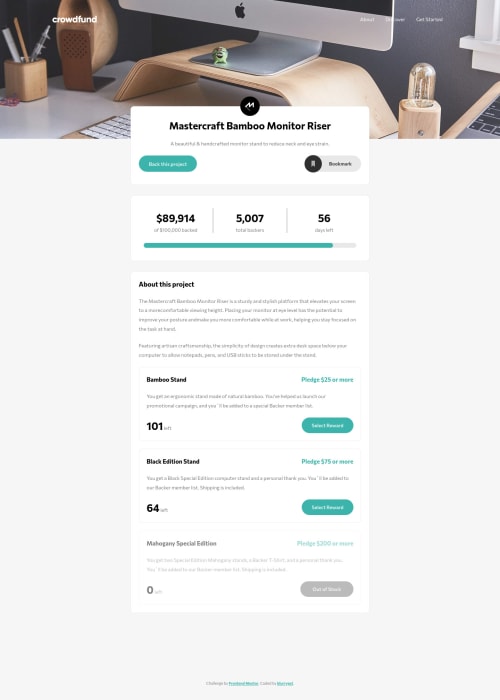
Crowdfunding Product Page Main - HTML/CSS & JS
Design comparison
Solution retrospective
Hello everyone ๐ this my another solution from frontend mentor challenges. Please let me know if you have any suggestions. Thank you ๐
Community feedback
- @ereljapcoPosted almost 3 years ago
Hello, Alif. Great work! Tried the functionality of your work. The amount backed and number of total backers is updating, however the number of items left isn't.
Marked as helpful1@blurrypxlPosted almost 3 years ago@erelita Hi Erelita๐ Thanks for checking the functionality of my work๐ and yes there's still a lot I need to improve on. I will take a look back at my code to improve it๐.
0 - @elroytoscanoPosted almost 3 years ago
Hi Alif, good job with the visual designs, their perfectly responsive. Here's how you could improve the designs further:
- While hovering over the bookmark, change the background color as it would provide visual feedback.
- When you switch to a responsive view, use
cursor:pointer
for the hamburger menu option as it would provide visual feedback. Additionally, when you hover over any kind of navigation link or menu item, usecursor:pointer
and change the background color of your choice, to indicate visual feedback.
Marked as helpful1@blurrypxlPosted almost 3 years ago@elroytoscano Hello Elroy, thank you for your suggestion. I appreciate it๐. I will take a look back at my code to improve it :)
1
Please log in to post a comment
Log in with GitHubJoin our Discord community
Join thousands of Frontend Mentor community members taking the challenges, sharing resources, helping each other, and chatting about all things front-end!
Join our Discord