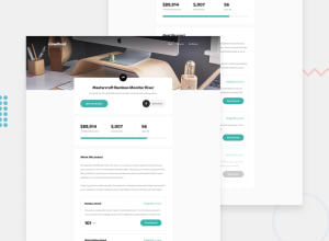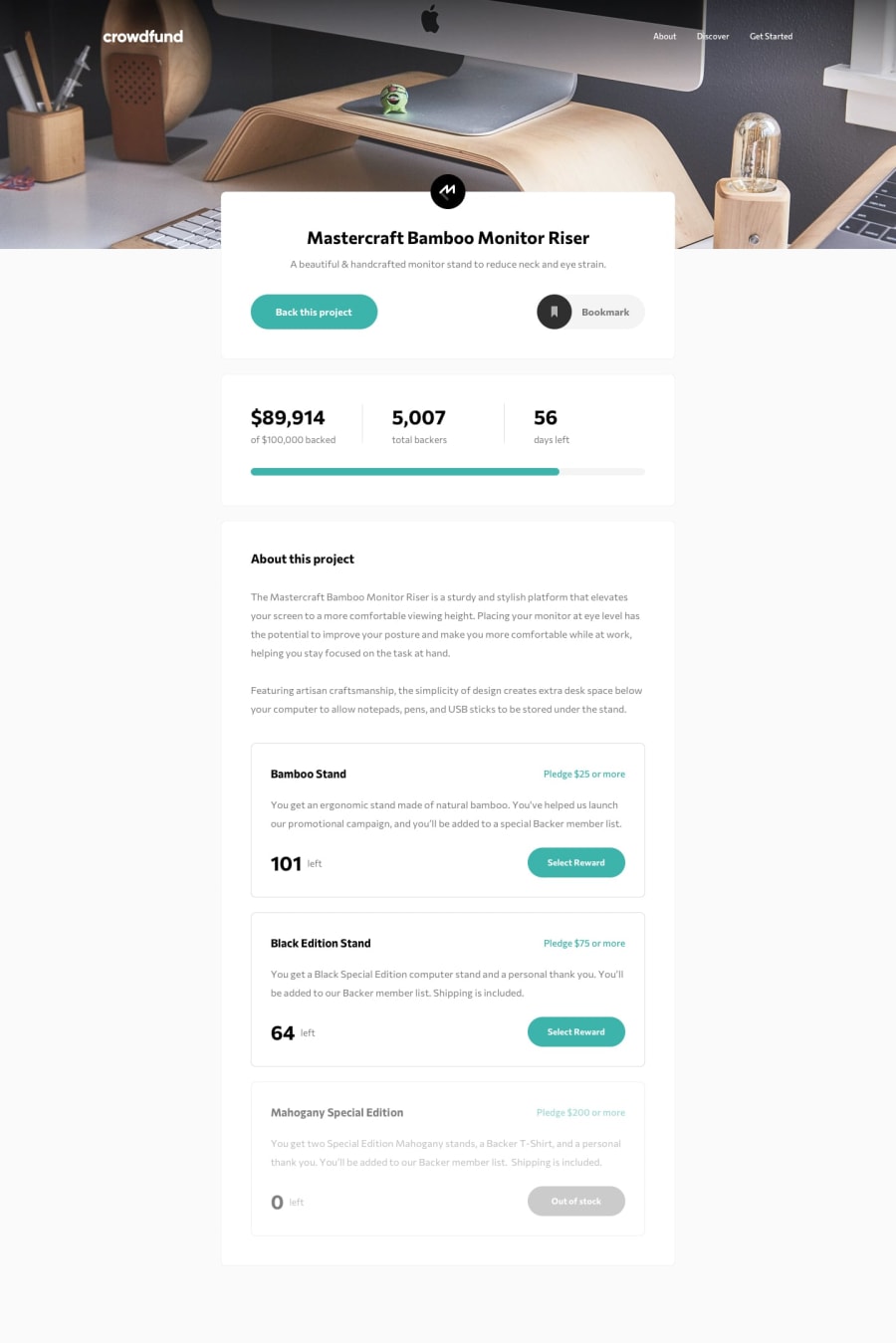
Design comparison
SolutionDesign
Solution retrospective
Couldn't quite work out how to set an editable starting value for the pledge input amount and would have liked the modal to open with the selected reward option focused. I also found the animations to be tricky to implement, so will try to refactor those some time soon.
Other than small styling inconsistencies (no design file to work off), what else could I have done better? Any feedback or improvements to my process is much appreciated. Thanks!
Community feedback
Please log in to post a comment
Log in with GitHubJoin our Discord community
Join thousands of Frontend Mentor community members taking the challenges, sharing resources, helping each other, and chatting about all things front-end!
Join our Discord
