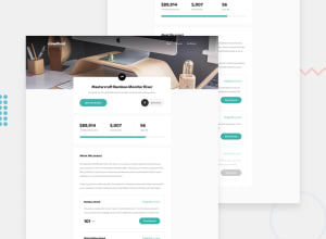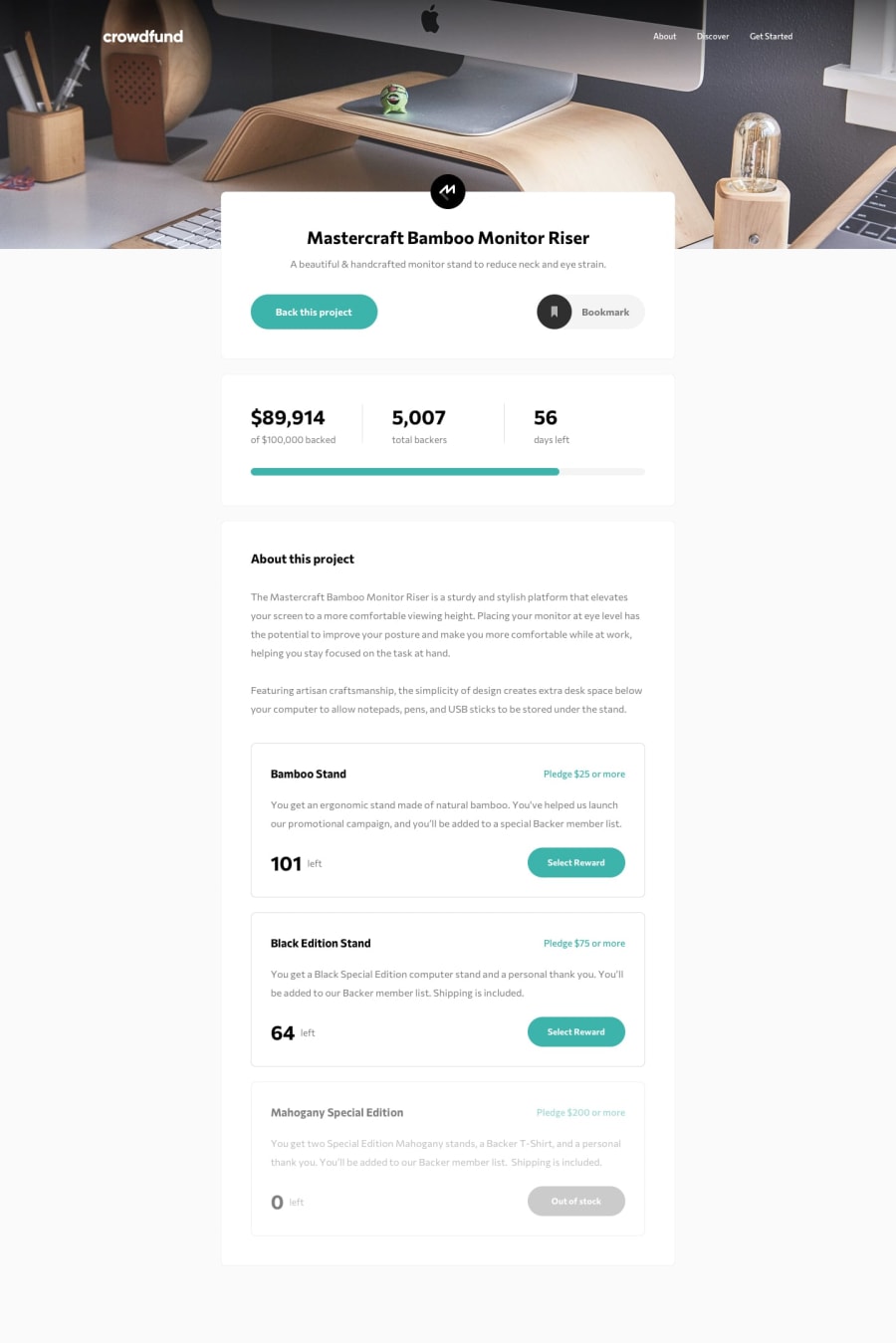
Design comparison
Solution retrospective
I had some trouble figuring out the grey background at first, but it was an easy fix after I finally got to solving it. At first glance I thought this website would be very hard to make, but it wasn't too bad. It just made me realize how I should focus more on organizing my code. Next time I will create more reusable classes. Any tips on organization?
Community feedback
- @AngelusLovellPosted over 3 years ago
Bro,
-
Image of your "dropdownButton" for mobile devices is not working. Removing a dot from the url in the js file should fix the problem. Change it so that the url contains only one dot i.e
img = "./images/icon-close-menu.svg";in line 103 and 106 with there respective url. -
Also you don't need to create two element for same background image, Instead you should simply use "picture" for your header background image.
Hope this helps. 😀
1@shake88juntPosted over 3 years ago@ShashaGazem Thanks, I'll take a look at that. Yes, I should use picture, I forgot you could use media queries for that. Appreciate it man
0 -
- @ConradMcGrifterPosted over 3 years ago
it looks very nice but you didn't add any of state management. for example if I make a pledge, the number of backers should go up and the amount of money pledged should be added to the total. other than that, you did a very good job!
1@shake88juntPosted over 3 years ago@ConradMcGrifter Yeah, I might take a look at that if I get bored later. Should be pretty easy fix.
0
Please log in to post a comment
Log in with GitHubJoin our Discord community
Join thousands of Frontend Mentor community members taking the challenges, sharing resources, helping each other, and chatting about all things front-end!
Join our Discord
