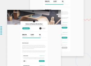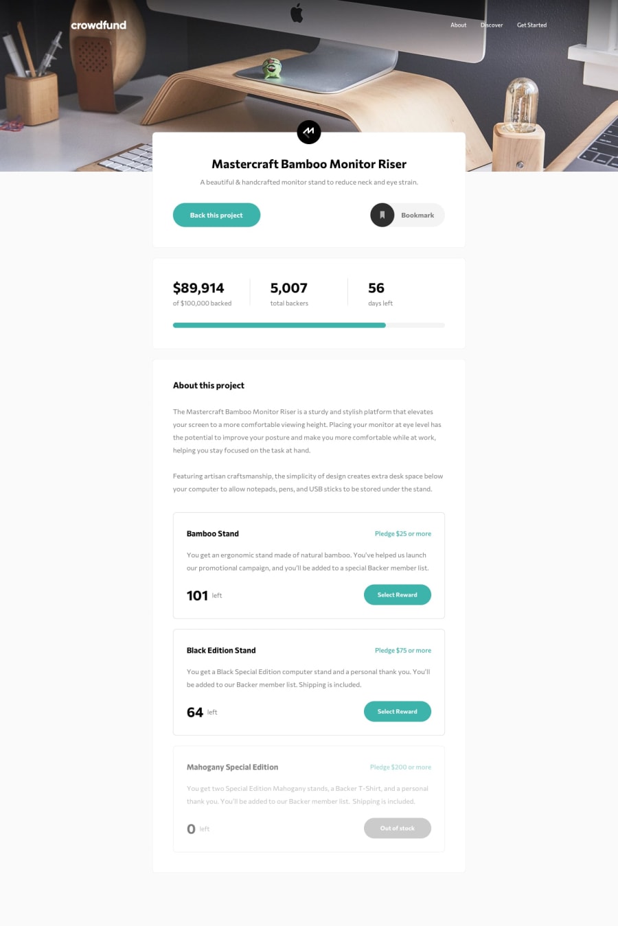
Design comparison
Solution retrospective
This was an interesting challenge, I used Vuex to manage the state of my application for the first time.
Questions:
- Any best practices on Vue & Vuex I could use to improve this project?
- I couldn't find a good solution to change attributes in my SVG programmatically inside Vue, any suggestion is welcome.
- Any other feedback is welcome.
Community feedback
- @Abass1998Posted over 3 years ago
Impressive job! I think the background image at the header section is a bit different from the real design. You may want to look at the background properties you used and padding sizes. Nice attempt.
Marked as helpful1@jmnyaregaPosted over 3 years ago@Abass1998 Thanks for pointing this out, I was using a mobile image on desktop 🤦.
0 - @palgrammingPosted over 3 years ago
The main thing I see is also seen in the screenshot comparison and that is you need some margin on the bottom of your layout cause right now the page just ends at the bottom of the browser and without that space make it feel like something is missing or that all the page failed to load
Marked as helpful0@jmnyaregaPosted over 3 years ago@palgramming Thanks for the feedback. That's true, I need some margin on the bottom.
0 - @jmnyaregaPosted over 3 years ago
I am out of screenshots this month(the screenshot is still the same), I have made the updates.
0
Please log in to post a comment
Log in with GitHubJoin our Discord community
Join thousands of Frontend Mentor community members taking the challenges, sharing resources, helping each other, and chatting about all things front-end!
Join our Discord
