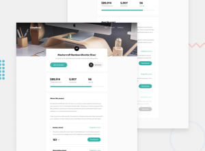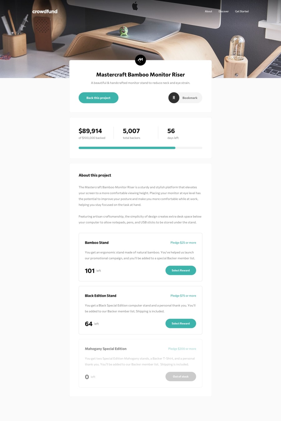
Design comparison
SolutionDesign
Solution retrospective
I'd appreciate having any feedback.
Community feedback
- @skyv26Posted almost 3 years ago
Yehla, Your reward cards have some issue. After selecting rewards when user try to select any one plan, there the $ symbol at 2nd card is going outside it border container and same is happening with 3rd one.
Tip: use Display flex property
Display: flex; flex-direction: row; align-items: center; justify-content: space-between.
Try to fix this minor issue, later I will tell more.
Marked as helpful0
Please log in to post a comment
Log in with GitHubJoin our Discord community
Join thousands of Frontend Mentor community members taking the challenges, sharing resources, helping each other, and chatting about all things front-end!
Join our Discord
