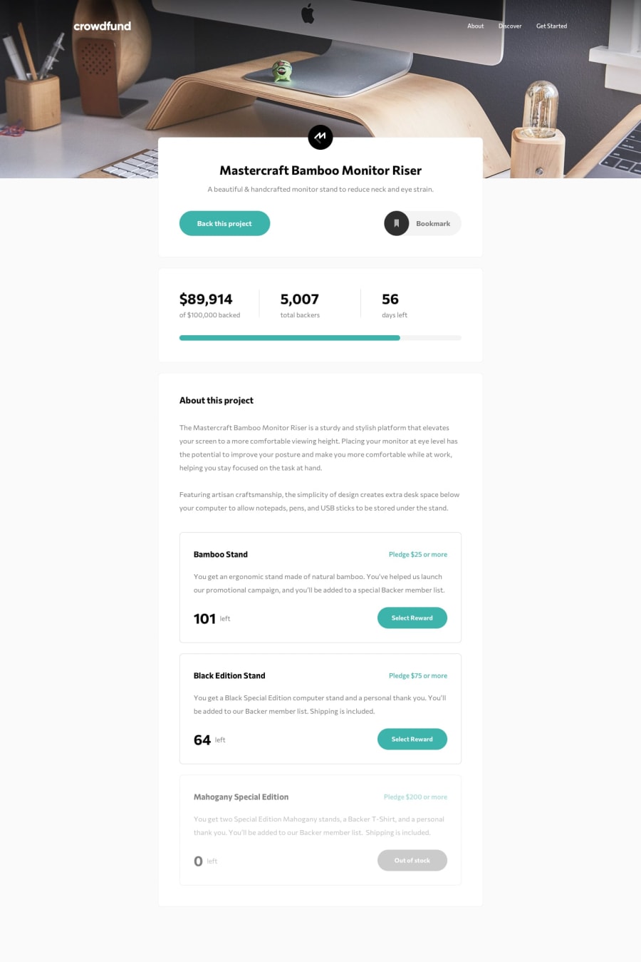
Design comparison
Solution retrospective
First year's challenge after my vacation, First time using SCSS with its @mixin as a responsive template, nesting class and pseudo / hover styles. Been experimenting with chatgpt with this site for simple solutions to some issues with styles and the simplification of some functions.
However there are some issues when it comes to some after pseudo elements and the nav function for the overlay which somehow works on live servers but not githubs website version.
Most importantly, I've yet to find a clean solution besides adding a margin to the main card to make it align with the bottom of the background image. if you know a possible solution, feel free to tell.
Community feedback
Please log in to post a comment
Log in with GitHubJoin our Discord community
Join thousands of Frontend Mentor community members taking the challenges, sharing resources, helping each other, and chatting about all things front-end!
Join our Discord
