Design comparison
SolutionDesign
Solution retrospective
What are you most proud of, and what would you do differently next time?
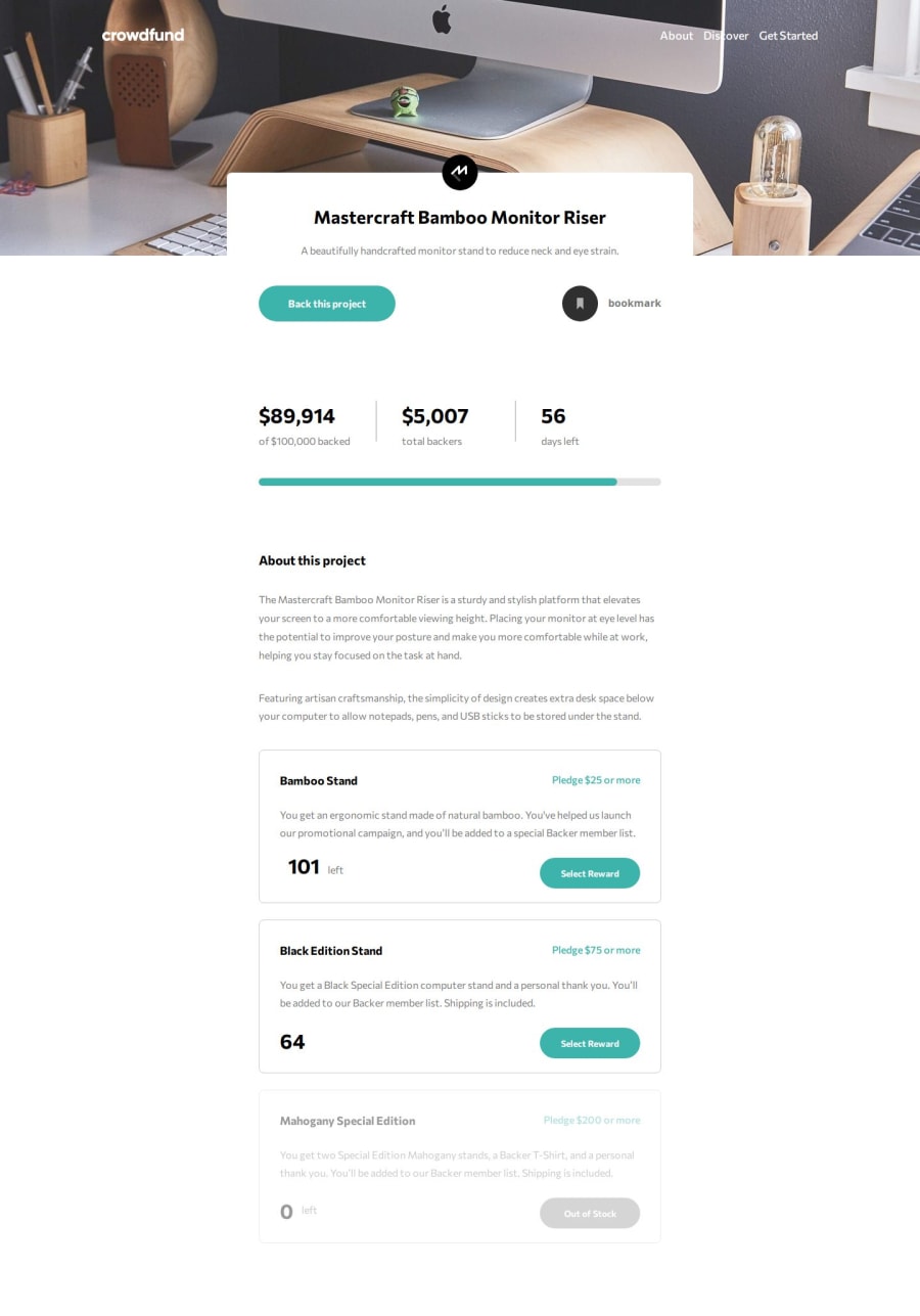
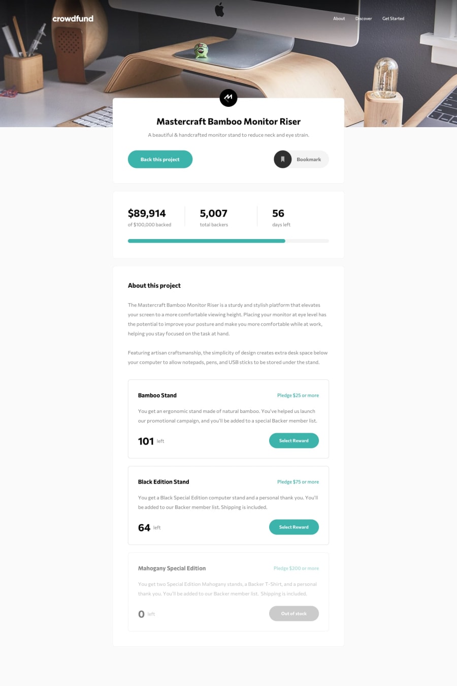
Hi here is my solution for Crowdfunding-product-page. I used HTML, CSS, JS.
What challenges did you encounter, and how did you overcome them?It was to display the good page and transfer the information in order to modificate the data on the main page.
Reach different parent and child nodes
arraySelect[i].firstElementChild.firstElementChild.classList.add('button-project-click');
arraySelect[i].firstElementChild.childNodes[3].style.color = '#3CB3AB';
arraySelect[i].parentElement.style.border = '0.15rem #3CB3AB solid';
It's to have some tips to improve my JS and have more readibility and shorter code.
Thanks.
Community feedback
Please log in to post a comment
Log in with GitHubJoin our Discord community
Join thousands of Frontend Mentor community members taking the challenges, sharing resources, helping each other, and chatting about all things front-end!
Join our Discord
