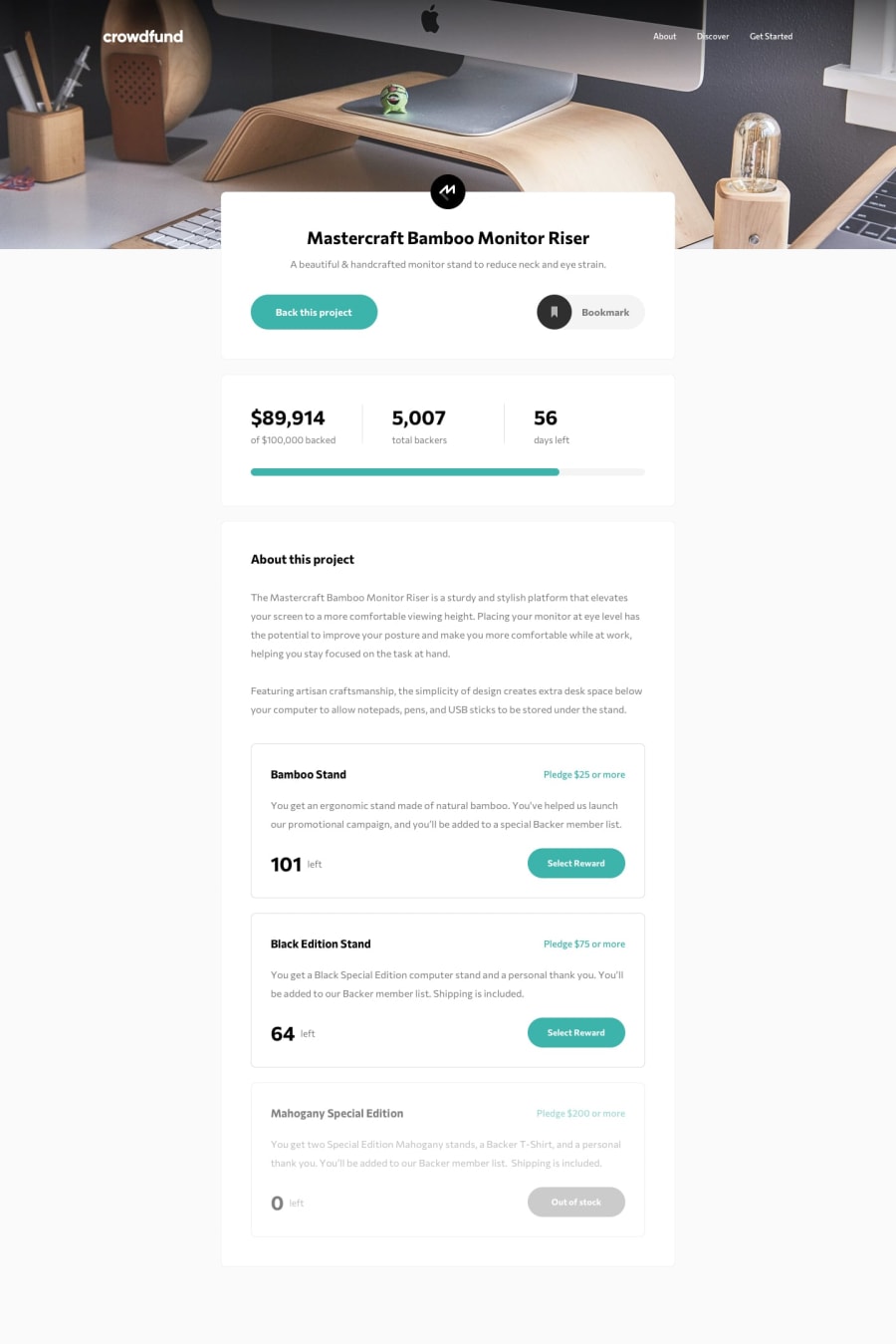
Design comparison
Solution retrospective
Any feedback is welcome!
Community feedback
- @jorge-echePosted almost 2 years ago
Very smooth transitions, much nicer than mine haha The only big flaw I notice is that the amount left of the pledges is not going down after making a pledge, which was one of the to-dos of the challenge. Another minor detail is you could make the about button of the header to take you to the About section down the page. Great work!
0@EduardIonescuPosted almost 2 years ago@jorge-eche The backers and the amount of money have to go up after submitting a pledge haha. Thanks for the suggestion for the about button!
0@jorge-echePosted almost 2 years ago@EduardIonescu Hi Edu, I mean the amount left of the pledges, for example from 101 to 100 after making a $25 pledge or from 64 to 63 for the $75 pledge. Cheers!
Marked as helpful0@EduardIonescuPosted almost 2 years ago@jorge-eche Oh, that's true, I'm sorry and thanks!
0
Please log in to post a comment
Log in with GitHubJoin our Discord community
Join thousands of Frontend Mentor community members taking the challenges, sharing resources, helping each other, and chatting about all things front-end!
Join our Discord
