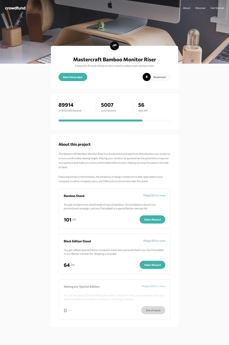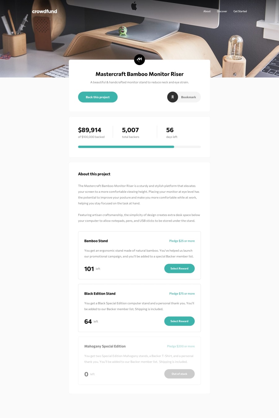
Design comparison
SolutionDesign
Solution retrospective
What are you most proud of, and what would you do differently next time?
I quite like the animated numbers and progress bar.
I would use grid to create the pledge amount cards straight from the offset. Initially I implemented with flex boxes, however due to the necessary responsive requirements, I found it easier to implement with grid as it was more straight forward to re-arrange the elements on the card for mobile view.
What challenges did you encounter, and how did you overcome them?The overlapping of the main content div on the header took a bit of time researching grid settings to get the desired result.
What specific areas of your project would you like help with?Any feedback would be welcome, in particular for the JavaScript code.
Community feedback
Please log in to post a comment
Log in with GitHubJoin our Discord community
Join thousands of Frontend Mentor community members taking the challenges, sharing resources, helping each other, and chatting about all things front-end!
Join our Discord
