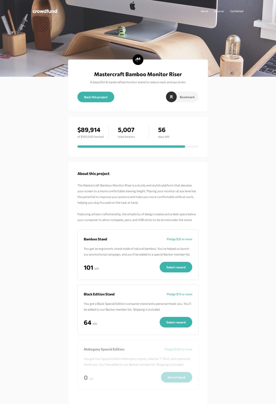

Design comparison
SolutionDesign
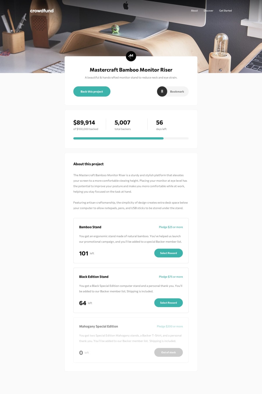
Solution retrospective
This was very good practice for React. There's a ton of components, state handling and dynamic styling going on. Very challenging at some points to make it all work together. I've also used modular/component based styling to keep overview.
I did make a few alternative decisions opposed to the original design:
- Pledge options are dynamically rendered by product availability. Cause why render a pledge option in the modal if it's out of stock anyway? It didn't make sense to me.
- I did not really like the radio button in the pledge options. I opted to indicate which one is active by just using border color and closing other options/accordions automatically (if open..)
- Added a few subtle animations.
If you have any feedback or improvements I'd love to hear from you.
Community feedback
Please log in to post a comment
Log in with GitHubJoin our Discord community
Join thousands of Frontend Mentor community members taking the challenges, sharing resources, helping each other, and chatting about all things front-end!
Join our Discord