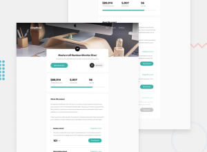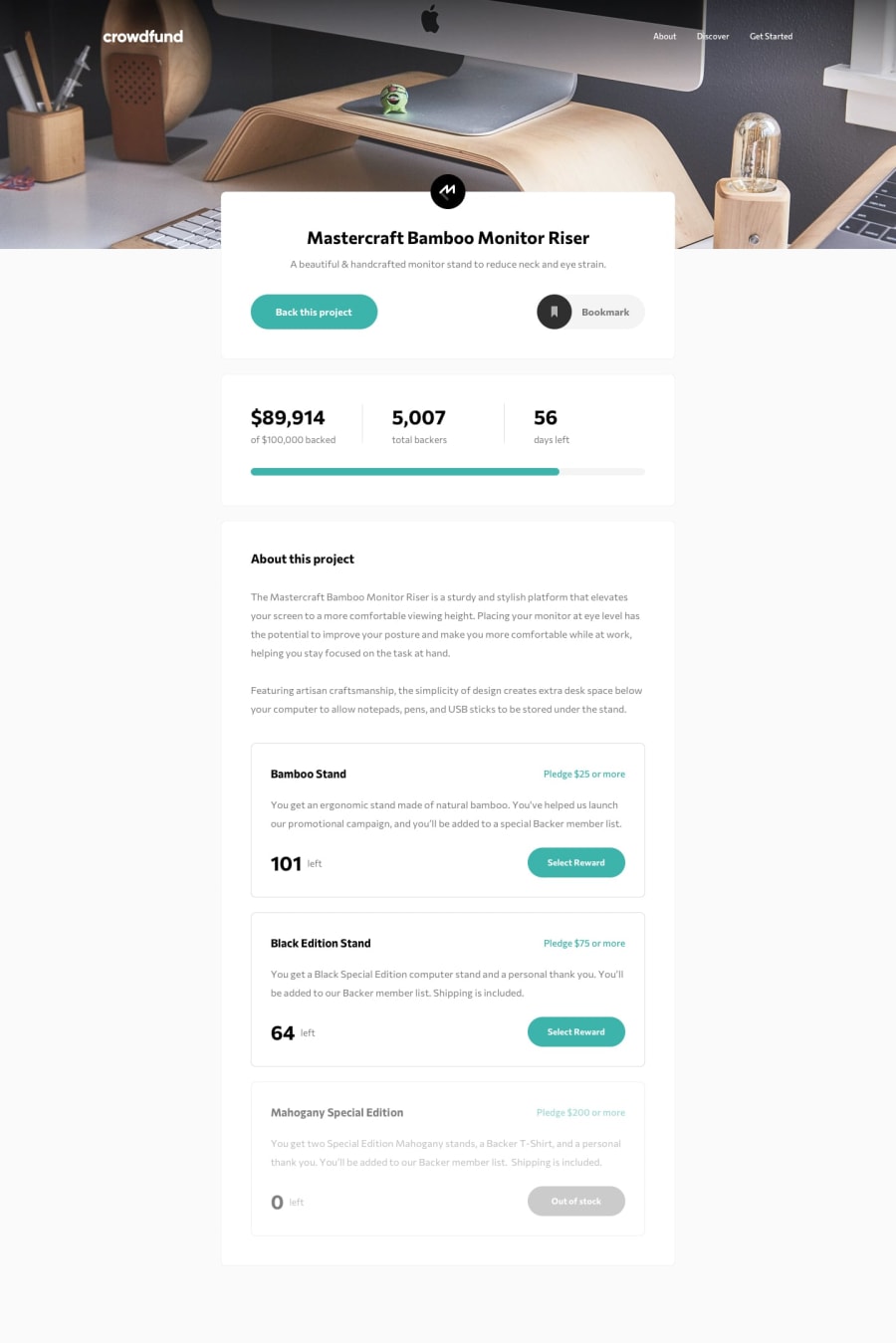
Submitted over 2 years ago
Crowdfunding Page - Vue 3, Composition API, TypeScript
@ccreusat
Design comparison
SolutionDesign
Solution retrospective
Any feedback is welcome!
Community feedback
- @besttlookkPosted over 2 years ago
Hi, Everything looks nice except one thing.
- Currently header links and logo is touching the screen. For wide screen the gap between the both side would be huge. And that will not look nice. Always try to wrap the content with some wrapper. You can do something like this.
<header>
  <div class="header-wrapper>
    //hesder content
   </div>
</header>
.header-wrapper{ width:90vw; max-width:1280px; margin: 0 auto: // to center the element padding-inline :1rem; }Good Luck,
Happy coding
0@ccreusatPosted over 2 years ago@besttlookk Hello ! Thanks for your comment. I completely forgot to add this container/wrapper. It was in the Figma file, 1110px max-width (as always in Frontend Mentor designs)
0
Please log in to post a comment
Log in with GitHubJoin our Discord community
Join thousands of Frontend Mentor community members taking the challenges, sharing resources, helping each other, and chatting about all things front-end!
Join our Discord
