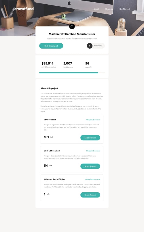
Crowdfunding Page - Mobile First, Sass, JS, modal & input
Design comparison
Solution retrospective
I tried to support assistive technologiesโฟ as much as possible.
- All interactive elements can be accessible by keyboard focus.
- I tried to tackle "keyboard trap" to avoid focusing elements on original page when opening the modals, however I could not achieve by solution. Could someone give me a good advice on it? ๐
Here is the functions of this website;
- Bookmark button should be toggle.
- The target value, backers and the progress bar should be updated upon every donation.
Select Reward
button andContinue
button should be disabled when amount left gets0
. - I still have an issue on changing the container to get lower opacity.- Amounts left on main page and modal should be updated upon each donation.
- By pressing
Escape
key, modal should be closed. - By clicking modal's overlay, modal should be closed.
I am now focusing on WAI-ARIA and the coding on JavaScript. Any suggestions and feedbacks are welcome!
Community feedback
- @mattstuddertPosted over 3 years ago
Awesome work on this challenge! It's great to see you learning and focusing on WAI-ARIA. It's such an important area that many people brush over, so keep at it ๐
With the
opacity
issue, are you saying thebutton
should be slightly transparent when someone adds "0" as a value? By looking at your code, it seems you're trying to manually set a lot of things instead of letting the browsers do the heavy lifting. For example, you've gotmin
andmax
values on the number inputs, but you've addednovalidate
to the forms, which mean the attributes will be ignored.Your
forms.forEach
is also pretty big. I'd recommend breaking code out into smaller, reusable, named functions wherever possible. It will make your code much easier to reason about.I noticed that once you select a reward, it's not possible to tab to any other rewards within the modal. So if I selected the first award but then changed my mind to the last reward, I wouldn't be able to update my selection if I navigate using my keyboard.
I mentioned in Slack that if this were a real-world project, you'd typically use an accessible modal package like a11y-dialog. You could try incorporating something like that into the project to practice building a fully-tested, robust modal popup. Completely optional, of course, but I'm sure it would be worth the effort!
I hope this helps. Keep up the great work! ๐
Marked as helpful0@Sloth247Posted over 3 years ago@mattstuddert Thank you very much for your comments.
-
Opacity issue: I would like to make entire container (
.main__project-details-pledge-item
) blurry for reward with amount "0". That means border and texts must have opacity: 0.5 as I set in.disable-pledge
in my_main.scss
file. Currently only button gets blurry. I tried different ways many times but it does not work. -
"I noticed that once you select a reward, it's not possible to tab to any other rewards within the modal. " You can select other rewards with down arrow key on keyboard. For radio buttons, only down arrow key is working but is it wrong? (I am not sure what is correct).
-
11y-dialog: I thought it is kind of software or something, but you mean I copy some codes from the website? I mentioned [this smashing magazine] (https://www.smashingmagazine.com/2021/07/accessible-dialog-from-scratch/) and this github solution, and mostly copied their methods into my VS code. However it did not work for me and I do not know why ๐
Sorry it may be too much to ask, but it was very good practice for me to sharpen my JS skills.
0@mattstuddertPosted over 3 years ago@Sloth247, you're welcome!
- I wouldn't recommend blurring the content, as you'd still want people to be able to read it. Changing the button looks when there are no rewards left, as you have done, is fine.
- You'd expect to be able to tab through the items, and the focus states should follow the order of the focusable elements on the page. If you're manually forcing a navigation path, then that's usually a sign you're doing something not quite right.
- Feel free to leave that and maybe tackle it on a future project. You'd typically use the npm package or something to pull it into your project. But seeing as you're using plain JS, there's no need to over-engineer it.
Keep up the great work! It's awesome you're paying so much attention to accessibility. Keep learning about it and with each project you'll get better and better ๐
Marked as helpful0 -
Please log in to post a comment
Log in with GitHubJoin our Discord community
Join thousands of Frontend Mentor community members taking the challenges, sharing resources, helping each other, and chatting about all things front-end!
Join our Discord