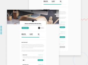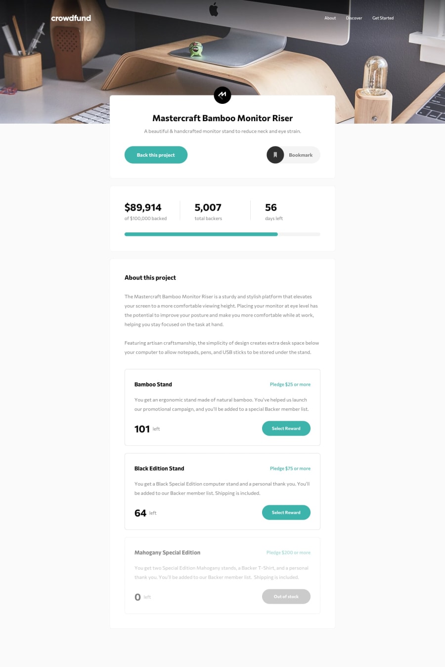
Design comparison
Solution retrospective
OK second try with this one! I think I've fixed the modal issue now - it was off screen before and wouldn't scroll. Based on my testing it works now. As before, I've used inert to make the modals work properly, and gap quite extensively, which means this challenge only really works well on Chrome.
The modal design doesn't match the design specifications properly. This is my fault for not pausing to review things at the start. Matching better would involved a lot of HTML restructure. I've made a list to follow on how to approach things now and I hope I won't end up in such a situation again.
Thanks for any feedback!
Community feedback
- @jbbenavidesrPosted over 3 years ago
It looks great now! Really like how it is working and yesterday's issue is solved.
I would only suggest that when I open the modal through one of the options, that option appears selected.
1@dwhensonPosted over 3 years ago@jbbenavidesr Oh that is a nice idea - yes ideally the option that you clicked to open the modal should be selected.... I'll put this on the list to come back to. I think I need a change/rest for now! Cheers!
0 - @ApplePieGiraffePosted over 3 years ago
Hey, Dave! 👋
I think this is pretty great! 🙌 The design looks good and everything works really well! 👍
One thing that I think would be nice is if you would allow users to select a funding option by clicking on each of the cards (rather than just the labels of the cards) to make selecting an option a little easier.
Adding a disable-scroll class to the body when the modals are open might be nice, too, so that the user doesn't do any accidental scrolling of the background.
Also, you could add
cursor: not-allowedto the last disabled option to further illustrate the fact that it isn't selectable. Just a tip! 😉Keep coding (and happy coding, too)! 😁
1@dwhensonPosted over 3 years ago@ApplePieGiraffe thanks as always for the great ideas here.
I had a play with your first suggestion, but as I'm using
input:checked ~ divto open the extra bit of the modal it totally messes things up if I wrap the card in the label - but I can see that usability your suggestion makes total sense.Any other way to do this aside from using the label to wrap the entire card? I can't see how if I also want the input to change.
Fixed the body scroll issue already thanks and I added the
cursor: not-allowedproperty too - I'd not come across that one before - nice!Cheers and thanks as always!
1@ApplePieGiraffePosted over 3 years ago@dwhenson
Glad to be of help (as always, too)! 👍
Hmm... IDK how you could do it with just CSS, but maybe you could add an event listener to each of the funding options and toggle the corresponding radio button when an option is clicked using JS? 🙂 It might be a good idea since keyboard users could still access and use the labels + radio buttons but others could still take advantage of directly clicking the options via the event listeners.
1@dwhensonPosted over 3 years ago@ApplePieGiraffe yes, that would work I think. I also cannot see a CSS only solution there. I might revisit this one at some point
@jbbenavidesr made a nice suggestion below too on how to improve the usability.
Cheers!
1 - @jbbenavidesrPosted over 3 years ago
Hey, about the modal I've got an issue... When I open it, it gets cut at the bottom of the screen and there's no way for me to access what's below because it is fixed. When I try to scroll, the background moves but not the modal.
You can maybe solve this by adding scroll to the modal and removing it from the background or something like this. I think I did that once by setting the background height to just 100vh while the modal is open, but I don't remember exactly how I approached that.
1@dwhensonPosted over 3 years ago@jbbenavidesr thanks yes I can see that issue on my phone. A bit of a mess. Are you trying on Chrome?
As I mentioned above this will only work on chrome due to ‘inert’ not working on other browsers.
0@jbbenavidesrPosted over 3 years ago@dwhenson I get the same issue in firefox and chrome.
0@dwhensonPosted over 3 years ago@jbbenavidesr rats! Let me try and tackle this and get back to you! Thanks for taking a look.
0@dwhensonPosted over 3 years ago@jbbenavidesr I think it's fixed now - thanks for catching this one!
0 - @pikapikamartPosted over 3 years ago
Hey regarding about your question, well I think you cannot do that with css. Since keyboard and mouse state gives focus, and that
focus-withinis the same asfocus. What we could do is that, add some js. Like adding a key event, then checking if it is a tab key, checking the .keyCode if it is 9 since that is the keycode of tab key. Then checking both if the user pressed a tab, and if the .activeElement is your target input, then apply maybe a certain css to it. Well I could not think of any other answer about it? Still, if you know or did know, share it here^1@dwhensonPosted over 3 years ago@pikamart thanks. That seems pretty complicated!! I might be able to do the same with adding something like tab-index=0 perhaps?
0@pikapikamartPosted over 3 years ago@dwhenson well tab-index just changes the order right so if you think about it, it is still the same with or without having it. But, it can make it certain that your target input gets the first focus upon pressing tab, so that may help you with some js? (now it get's tricky)
0
Please log in to post a comment
Log in with GitHubJoin our Discord community
Join thousands of Frontend Mentor community members taking the challenges, sharing resources, helping each other, and chatting about all things front-end!
Join our Discord
