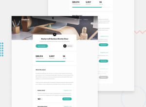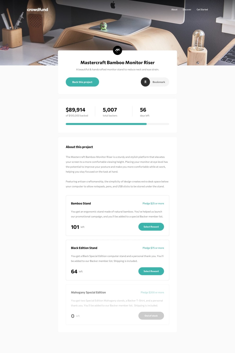
Crowdfund Product Page | React - Redux - Styled Components - Framer
Design comparison
Solution retrospective
Hey Frontend community!
After a little break, I've finally completed another challenge from Frontend Mentor: the Crowdfunding Product Page.
In short, I had a blast building this project using React, Redux, Styled Components, and Framer Motion. There were undoubtedly some moments where I became frustrated because I struggled with the Redux reducers and store, but with each component built and feature implemented, I got closer to a better understanding of how it all works.
I'm still working on improving my code in terms of maintainability and I'd love to know if you have suggestions on how I could do that with my Redux code. For example, I'm using multiple dispatch calls within a click function, but I think it'd be a better practice to have a single dispatch that calls multiple action creator functions.
Feel free to leave any suggestions / ideas you have on what I could do differently / better in my project.
Thanks a lot for taking the time to check out my project - you're awesome!
Community feedback
Please log in to post a comment
Log in with GitHubJoin our Discord community
Join thousands of Frontend Mentor community members taking the challenges, sharing resources, helping each other, and chatting about all things front-end!
Join our Discord
