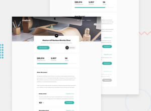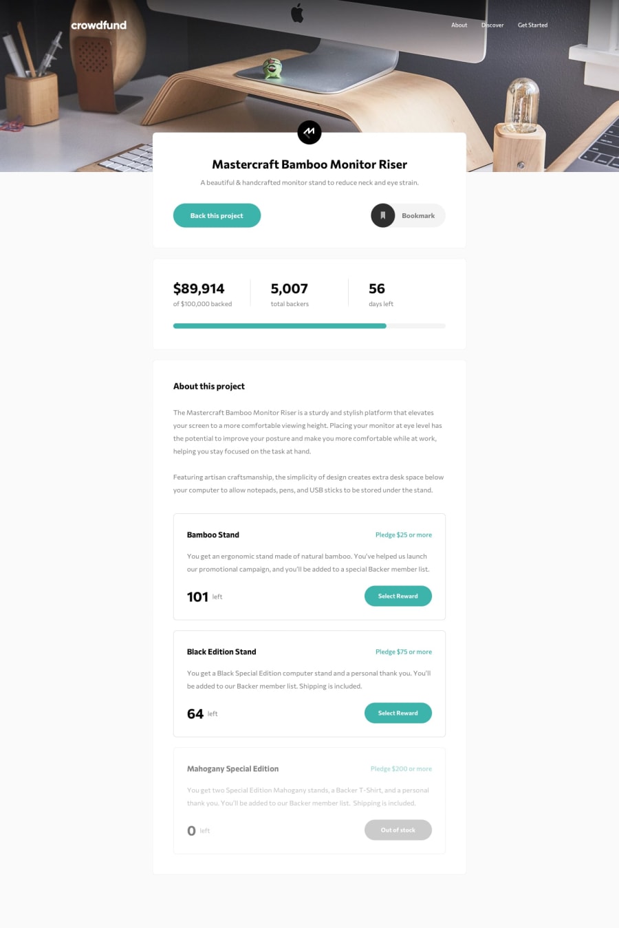
Design comparison
Solution retrospective
Here's my site. I have done almost every task which was given . Except , mobile responsive. Sorry for that :\ but the rest of the stuff is just working excellent. Thanks :)
Community feedback
- @dtomicicPosted over 2 years ago
Hey Kalp, I've looked at your solution and found some things you could improve.
First of all when you're at the top of the page and click bookmark it refreshes the page, same thing with select the reward, when you click it it just refreshes the page and sometimes the back this project button doesen't open the modal until you scroll down. That sounds to me like a JavaScript issue and you should look into that.
Next thing I stumbled upon is when the user donates the $ sign goes away from your total amount donated (image). Also when the donations go over a 100000 your progress bar goes out (picture), you can fix that by setting a max width on the progress bar fill so it doesen't go out even if the donations pass the 100000 mark. Next thing with donations is that you can input the negative numbers and then your donations go down (try donating -80000 and you'll see) you can fix that by just setting that the donation amount can't be less than zero.
Mahogany reward should be grayed out and disabled while yours isn't.
As for the modal you don't have any hover effects on the text and also a user can check all the boxes which I think shouldn't be possible (picture).
Hope this helps you solve some of the problems and issues you have, you could also look into doing the mobile design properly (I would suggest for your future projects to do mobile-first design since it will be easier for you to scale it up later rather than having to scale it down).
Other than that great job, keep it up 👍
Marked as helpful1@KalpChaudharyPosted over 2 years ago@dtomicic thank you so much for your great feedback Darko I'll try my best to solve those bugs you pointed out. And thanks again for supporting people like me :)
0 - @duncan91-opsPosted over 2 years ago
Amazing work on the project. One point to note: (The number of rewards remaining(or left) should decrease by one after every pledge depending on the reward picked). Try it out and tell me what you think.
Marked as helpful1
Please log in to post a comment
Log in with GitHubJoin our Discord community
Join thousands of Frontend Mentor community members taking the challenges, sharing resources, helping each other, and chatting about all things front-end!
Join our Discord
