Submitted over 2 years agoA solution to the Interactive card details form challenge
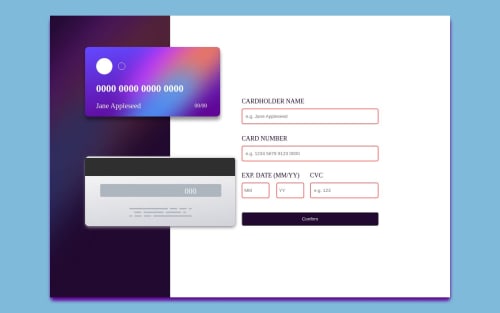
Credit card landing page
sass/scss
@Adebusayo0325

Solution retrospective
Making the name get shortened if the name is too long and making the numbers appear and add spaces in the texting
Code
Loading...
Please log in to post a comment
Log in with GitHubCommunity feedback
No feedback yet. Be the first to give feedback on Adebusayo Opeyemi's solution.
Join our Discord community
Join thousands of Frontend Mentor community members taking the challenges, sharing resources, helping each other, and chatting about all things front-end!
Join our Discord