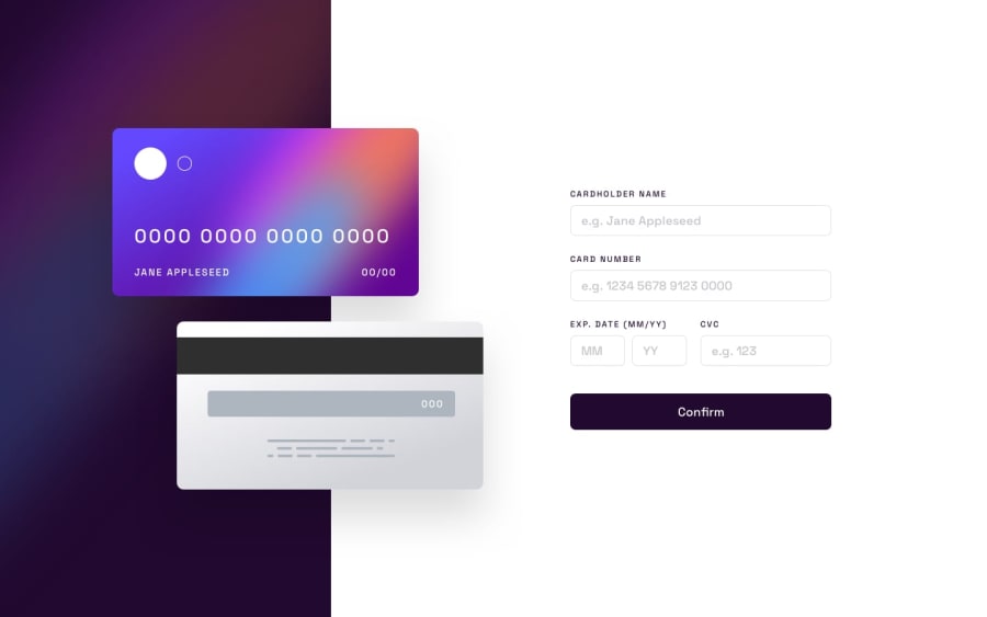
Design comparison
Solution retrospective
Hi ya'll 👋. This is my solution to the credit cards form challenge. As usual, I threw a dark mode in there. And I tried to work harder on accessibility in this challenge. What I found troublesome was adding a border-gradient to the inputs. I had intended on using pseudo-elements, but they don't work. I later settled for border-image(which doesn't work with border-radius). I would like to know if there are other approaches to this.
Any comments on the code and how to better it would be greatly appreciated. Happy coding💻,
Ayobami
Community feedback
- @0xabdulkhaliqPosted over 1 year ago
Hello there 👋. Congratulations on successfully completing the challenge! 🎉
- I have other recommendations regarding your code that I believe will be of great interest to you.
ID ATTRIBUTE 🛑:
- The
idattribute uniquely identifies elements on a page. It does not make sense to duplicate anid.
- Duplicate
id's can break the accessibility of labels for forms, table header cells, etc.,
- To fix the problem, change an
idvalue if it is used more than once to be sure each is unique. Uniqueid's differentiate each element from another and prevent invalid markup
- Ensures that each element on the page with an
idattribute has a uniqueidattribute value.
. HEADINGS ⚠️:
- And, this solution has also generated accessibility error report due to lack of level-one heading
<h1>
- Every site must want at least one
h1element identifying and describing the main content of the page.
- An
h1heading provides an important navigation point for users of assistive technologies, allowing them to easily find the main content of the page.
- So we want to add a level-one heading to improve accessibility by reading aloud the heading by screen readers, you can achieve this by adding a
sr-onlyclass to hide it from visual users (it will be useful for visually impaired users)
.
I hope you find this helpful 😄 Above all, the solution you submitted is great !
Happy coding!
Marked as helpful1@IkuewumiPosted over 1 year ago@0xAbdulKhalid, Thanks for the tips. I already solved the duplicate id issue no problem, but the h1 issue still comes up even though I have a hidden
<h1>in the<header>element. Any suggestions on how to fix that?0 - @ladyprogrammerPosted over 1 year ago
You're off to a good start! Nice attempt on the this challenge. I did mine just a couple of days ago and I find it quite a challenge as well.
I reviewed the design images and it doesn't appear to require those. They appear to be just plain colored borders. However if you are curious border gradient requires several properties added in CSS to make that work, not just one.
input {
   border: 1px solid rgba(...);
   border-radius: var(--br);     // this stopped working when border-image was used on hover
}

input:focus-visible {
   border-image-source: linear-gradient(20deg,hsl(249,99%,64%),hsl(278,94%,30%));
    border-image-slice: 1;    // need to have some value
    border-image-repeat: round;
}
I noticed that
border-radiusstopped working when you used border-image, so I appears they are not compatible. Also, at 1px border the gradient on focus isn't too noticeable unless you increase the px size to maybe 15px so you can actually see the gradient colors. So I am convinced this is just a solid border in one color. On checking via inspect element, the border gradient has been rendered all right - it's just not obvious because it's just 1px - so need to stress yourself out here!I noticed that the card doesn't update in real-time - it is only updated after submission, but as per listed in the requirements:
- Fill in the form and see the card details update in real-time
Which meant that the card details update as you type. Probably best add event listener "input" for every input and write a function to update the card details from there.
Other notable things to improve -
- It is cleaner to use the bg-front-card.png as a CSS background for the card, so you use lesser HTML code. Same is true with the backside of the card.
style.css
.card-front {
   background: url('/images/bg-front-card/png') no-repeat;
}
index.html
<div class="card card-front">
   // remove <img >
   <span>...</span>
</div>
...
Marked as helpful1@IkuewumiPosted over 1 year ago@ladyprogrammer Thanks for all these good tips. I just finished implementing them. The app is now realtime and the card images are now backgrounds. Kinda struggled on which approach to go with to keep the height of the cards consistent, and I ended up using the
aspect-ratiocss property. Thanks, again🙏0
Please log in to post a comment
Log in with GitHubJoin our Discord community
Join thousands of Frontend Mentor community members taking the challenges, sharing resources, helping each other, and chatting about all things front-end!
Join our Discord
