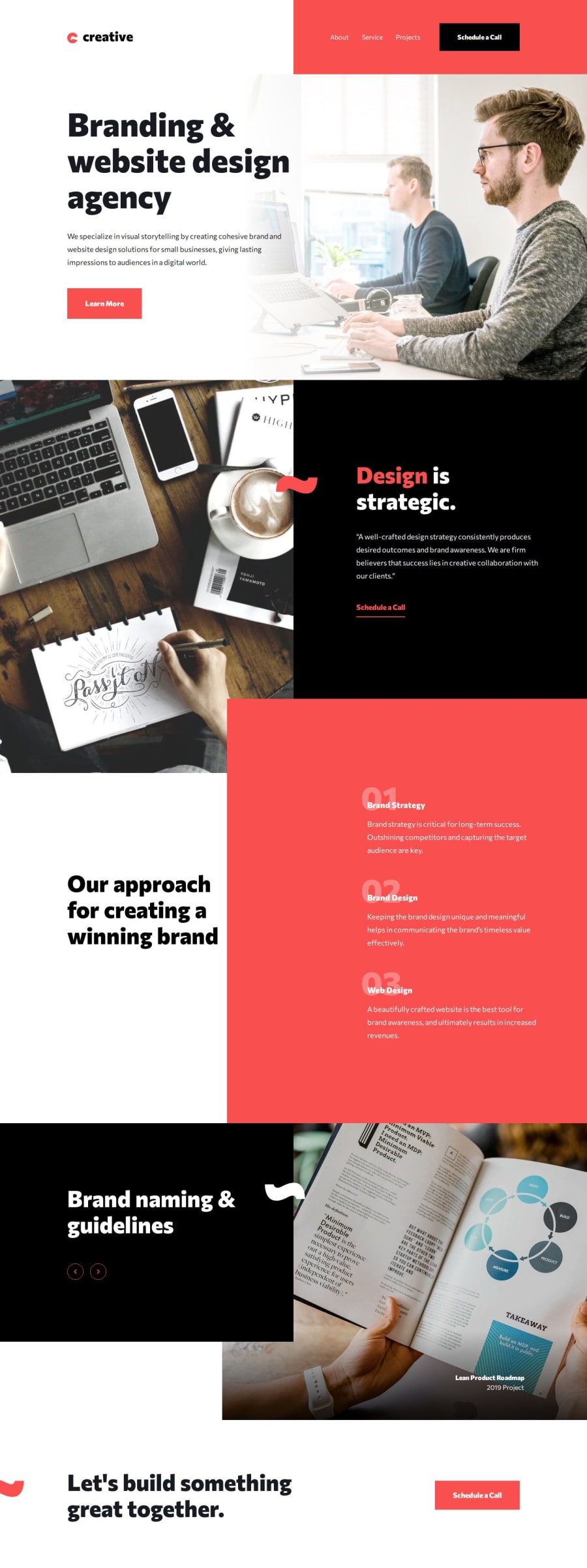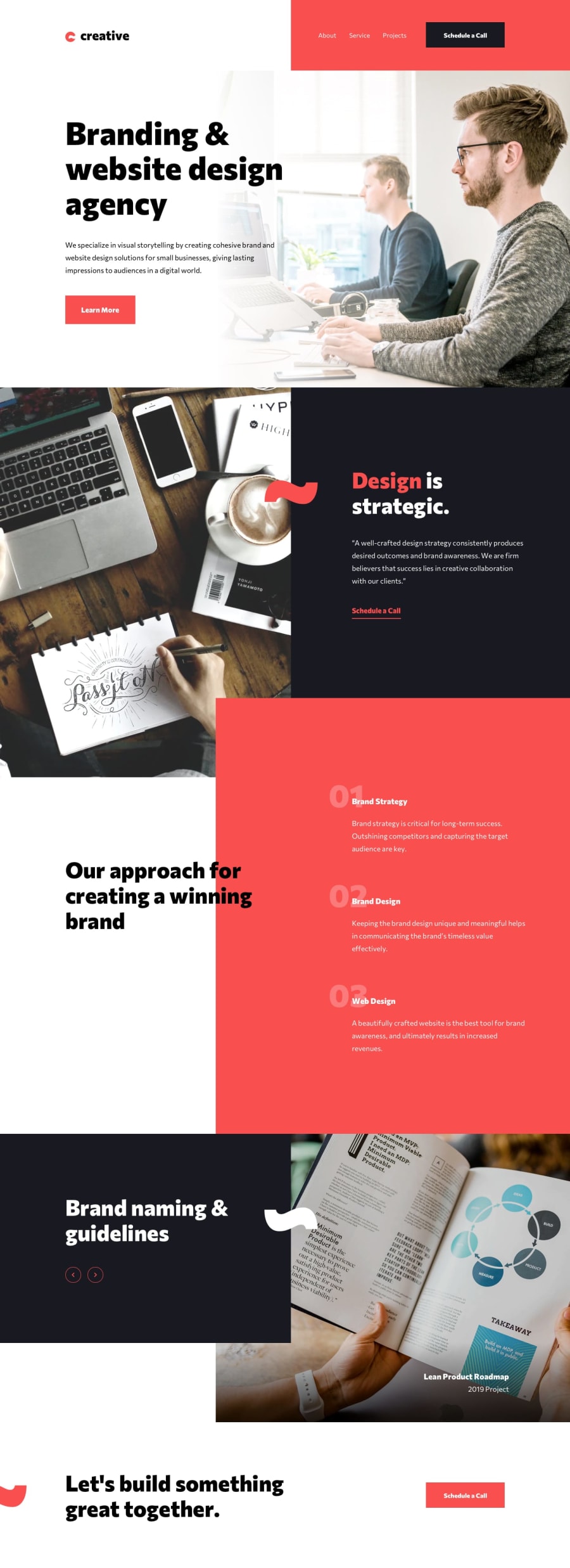
Creative agency single-page (Html, Css(Sass), Js)
Design comparison
Solution retrospective
In this challenge I trained myself to build this modern and geometric layout, with some sections which, at least at the beginning, I found a little difficult, but as I continued I managed to have a clearer vision of the whole and I think I can have arrived at a good solution.
Overall it was a really great exercise.
What challenges did you encounter, and how did you overcome them?The part that I found a little complex was the section where the slider is present, both the text part and the corresponding images; Especially because it changes radically from the mobile version to the tablet and desktop version, so I had to play around a bit to arrive at a solution that wasn't too complicated at code level, and that visually respected the design.
What specific areas of your project would you like help with?If you like, you could leave me some feedback regarding my solution, both from the point of view of layout construction, and in the coding part, including the Javascript code regarding the functioning of the slider.
I'm here, we can discuss it ;)
Community feedback
Please log in to post a comment
Log in with GitHubJoin our Discord community
Join thousands of Frontend Mentor community members taking the challenges, sharing resources, helping each other, and chatting about all things front-end!
Join our Discord
