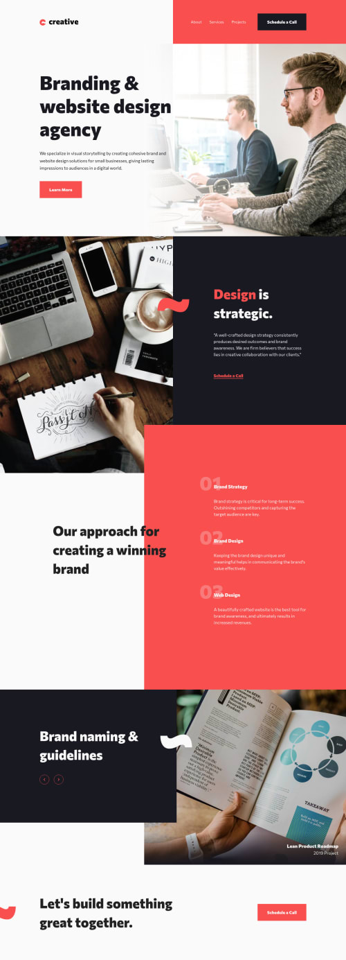
Submitted over 3 years agoA solution to the Creative agency single-page site challenge
Creative agency single page site | HTML, CUBE CSS, JS
sass/scss, typescript, webpack, cube-css
@christopher-adolphe

Solution retrospective
Hello frontend friends! 👋
I'm glad to have completed my 3rd challenge on Frontend Mentor. 🎉 On this project, I wanted to give a try to the CUBE CSS methodology to author my CSS. Check my readme.md for more details.
Major challenge(s):
- I have been using the BEM methodology for a very long time and as I looked at the design file of this project, I instinctively think in terms of blocks as this is the core of the methodology. When switching to CUBE CSS, I had to train myself to think differently so that I could compose the overall layout with utility classes. It felt a bit awkward 🤨 at the beginning.
- The fact that the images are part of the content but are offset to the edge of the page gave me some headaches. 🤪 I would be grateful if anyone could suggest a different way of achieving this.
Your feedback would be much appreciated. If you have some experience with CUBE CSS, please let me know what I can improve here.
Thanks in advance. 🙏
Code
Loading...
Please log in to post a comment
Log in with GitHubCommunity feedback
No feedback yet. Be the first to give feedback on Christopher Adolphe's solution.
Join our Discord community
Join thousands of Frontend Mentor community members taking the challenges, sharing resources, helping each other, and chatting about all things front-end!
Join our Discord