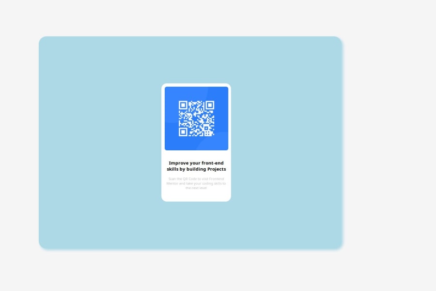
Creating QR code using HTML and CSS display and position property
Design comparison
Solution retrospective
Honestly I am proud that I was able to overcome my challenges and is now finally able to summit my solution
What challenges did you encounter, and how did you overcome them?Actually I encountered so many challenges but it wasn't all about creating the project but rather most was on deploying my project to Git-Hub Pages
What specific areas of your project would you like help with?I am Open to corrections because I know there might be better way to have completed the project so therefore anyone may preview my project and any suggestion on how I can improve on my HTML and CSS styles will be appreciated
Community feedback
- @DylandeBruijnPosted 4 months ago
@ClemFrance
Hiya! 👋
Congratulations on your solution, it looks very close to the design! I can tell you put a lot of effort into it.
Things you could improve ✍️
-
I suggest adding a bit of
paddingto yourbodyelement so the card has some space around it on smaller viewports. -
Try experimenting with the CSS layout tool Flexbox, it will help you greatly structuring elements on your webpage.
-
You could add a
min-height: 100vhto yourbodyelement so it takes up the full height of the viewport while still being able to grow when the content inside it grows. -
Try experimenting with CSS variables, they help you make your CSS values more reusable across your code.
-
I suggest using clear descriptive CSS classes like
.card,.card-titleand.card-description. -
Try using semantic HTML elements like
main,sectionandarticle. -
Try using using relative CSS units like
remandemthey make your layout more adaptable. -
Be careful with setting a fixed
widthandheighton your elements. If the content in these elements grows beyond these restrictions you’ll run into overflow issues. Keeping theheightatauto- whichblockelements are by default - will be fine in most cases. -
You don’t need to put
width: 100%onblockelements, they already take up the full width of their parents by default. -
You don’t have to wrap your image in a separate
div, it’s possible to style it directly to achieve the same result.
I hope you find my feedback helpful! 🌟
Let me know if you have more questions and I'll do my best to answer them. 🙋♂️
Happy coding! 😎
0 -
Please log in to post a comment
Log in with GitHubJoin our Discord community
Join thousands of Frontend Mentor community members taking the challenges, sharing resources, helping each other, and chatting about all things front-end!
Join our Discord
