Design comparison
SolutionDesign
Community feedback
- @te-saPosted about 1 month ago
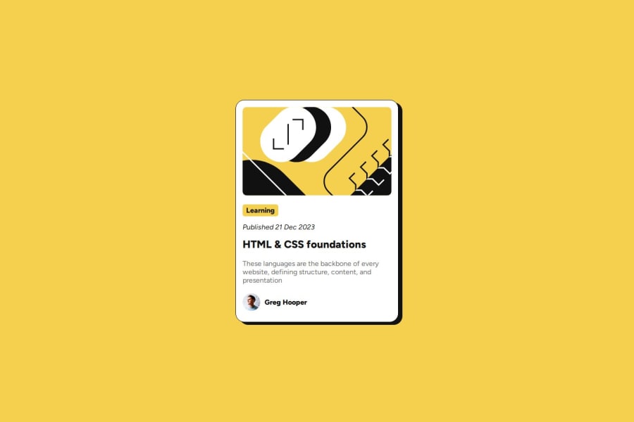
The solution is quite close to the design, so hats off to that! The code is also well constructed and readable.
A hover state for the header was not implemented, consider adding something akin to:
            h1:hover {
                color: hsl(47, 88%, 63%);
                cursor: pointer;
            }
Also, the card is not responsive on small screen sizes yet (width: 320px). Consider looking into the clamp() function, it really helped me make my page more responsive.
In general, good work!
0
Please log in to post a comment
Log in with GitHubJoin our Discord community
Join thousands of Frontend Mentor community members taking the challenges, sharing resources, helping each other, and chatting about all things front-end!
Join our Discord
