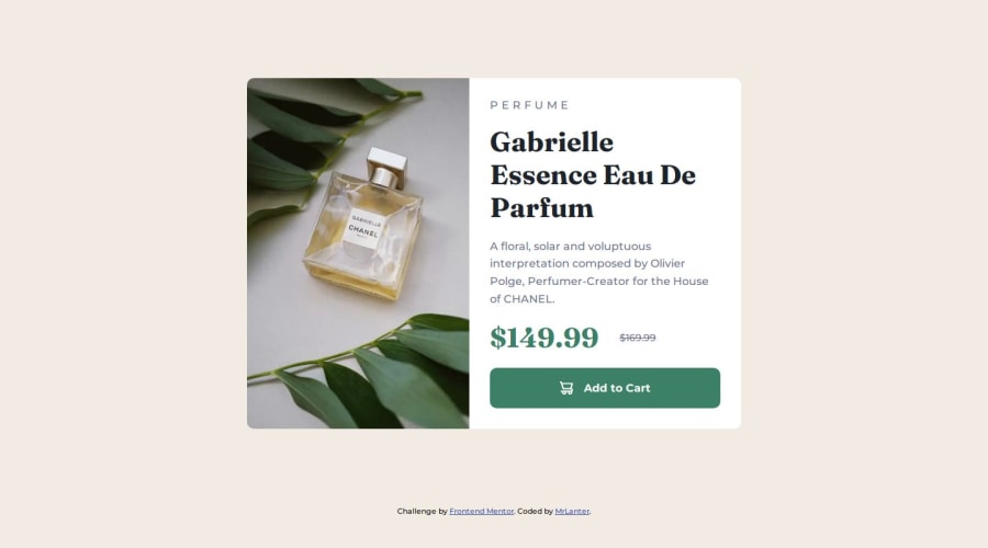
Creating a Responsive, Semantic, and Accessible Page with SCSS
Design comparison
Solution retrospective
I managed to optimize the loading speed of the site by using WEBP for fonts and images.
What challenges did you encounter, and how did you overcome them?-
The left image for the desktop version should be 100% height but the width did not fit.
-
There was unnecessary scrolling due to attribution. I tried to use
positiononabsolutebut for more than16pxfor1remthe texts were stacking.
I finally solved all these problems
What specific areas of your project would you like help with?- Is the HTML well organized ?
- Is the semantics correct ?
- What are the possible improvements ?
Community feedback
- @yusufuysalPosted 7 months ago
Congrats for finishing the project, MrLanter!
- Your HTML is well organized and semantically correct. You can use h3 tag instead of h2, which might be more appropriate for this case, but it is a very small adjustment.
- Accessibility is also mostly good. You can implement the following changes for aria-label and alt texts for images to be more descriptive:
Your code:
<button class="add-to-cart" aria-label="Add Gabrielle Essence Eau De Parfum to cart">My suggestion:<button class="add-to-cart" aria-label="Add Gabrielle Essence Eau De Parfum (Perfume) to cart">
Your code:
<img src="./src/assets/images/icon-cart.svg" alt="Icon Cart">My suggestion:<img src="./src/assets/images/icon-cart.svg" alt="Shopping cart icon">- Your layout looks good almost all screen sizes. The only issue I see is that on the ipad mini, the image looks stretched.
- Code is well-structured, readable, and reusable.
- I analyzed your page load with Lighthouse and all the metrics of Performance, Accessibility, Best Practices and SEO hsa 100 score. Great job, keep it up!
Marked as helpful0 - @carlosmarte23Posted 7 months ago
Hello!
You've done a fantastic job with your HTML; it's neatly organized, and the semantics appear to be correctly implemented from what I can tell.
As for SCSS, I'm still getting the hang of it. This project was my first encounter with it, so I don't have much to say yet, but kudos to you—the site looks amazing.
1
Please log in to post a comment
Log in with GitHubJoin our Discord community
Join thousands of Frontend Mentor community members taking the challenges, sharing resources, helping each other, and chatting about all things front-end!
Join our Discord
