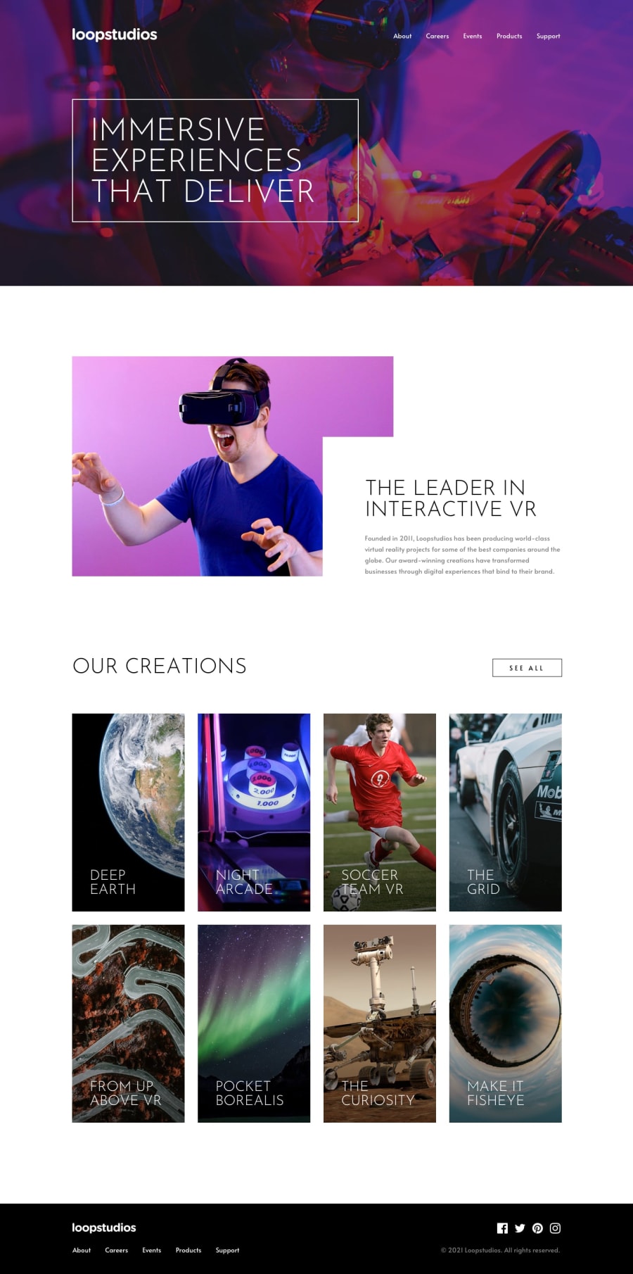
Design comparison
Solution retrospective
Any feedback on mistakes would be appreciated.
Community feedback
- @FluffyKasPosted about 3 years ago
Hey, well done, I think it looks very good! I'm just going to point out some issues to fix though:
-
There's a typo in the menu (it should say "Careers", not "Carrers").
-
In your mobile menu hover states don't really work well. It's not a huge issue, as there's no real hover on mobiles anyway, but it's still going to be visible when someone tries to tap on those links.
-
You forgot to set the font-family for some of your texts.
-
There's no hover on your cards at all. They're supposed to be links, not just pure images btw.
-
Take a look at the report, you seem to have a few html/accessibility issues as well ^^
0@Huseyn-SomeGuyPosted about 3 years ago@FluffyKas thanks for the feedback. I will fix those issues
0 -
- Account deleted
Its not pixel perfect but its good enough ❤️
0
Please log in to post a comment
Log in with GitHubJoin our Discord community
Join thousands of Frontend Mentor community members taking the challenges, sharing resources, helping each other, and chatting about all things front-end!
Join our Discord
