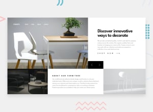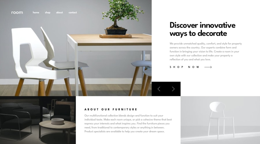
Design comparison
SolutionDesign
Solution retrospective
What are you most proud of, and what would you do differently next time?
Next time I would be making landing pages using Tailwind CSS, and follow a mobile first approach since most CSS Frameworks tend to have break points set in "Min-width" instead of "max-width" since I follow the large screen to small scree model of development
What challenges did you encounter, and how did you overcome them?I had difficulties positioning the slider buttons but a bit of perseverance and I managed to resolve my issue with position: absolute css property
No help needed in this, since a bit of review have shown me my errors. I made this project before submitting "Multi Step Form" solution, but had difficulties deploying it.
Community feedback
Please log in to post a comment
Log in with GitHubJoin our Discord community
Join thousands of Frontend Mentor community members taking the challenges, sharing resources, helping each other, and chatting about all things front-end!
Join our Discord
