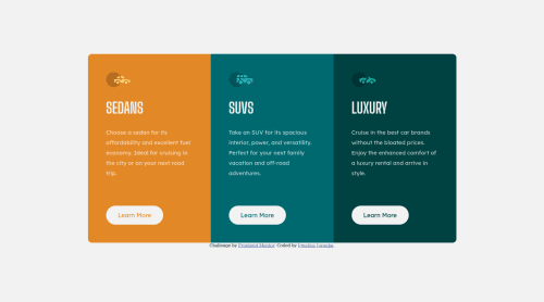
Submitted over 4 years agoA solution to the 3-column preview card component challenge
Created using only VS Code with pure HTML and CSS
@IgnJov

Solution retrospective
This is my 3rd challenge solutions, any problem or feedbacks or any improvement that I should make with CSS, HTML or Design? your feedbacks and comment really appreciated! Thank you :D
Code
Loading...
Please log in to post a comment
Log in with GitHubCommunity feedback
No feedback yet. Be the first to give feedback on Ignatius Jovanka's solution.
Join our Discord community
Join thousands of Frontend Mentor community members taking the challenges, sharing resources, helping each other, and chatting about all things front-end!
Join our Discord