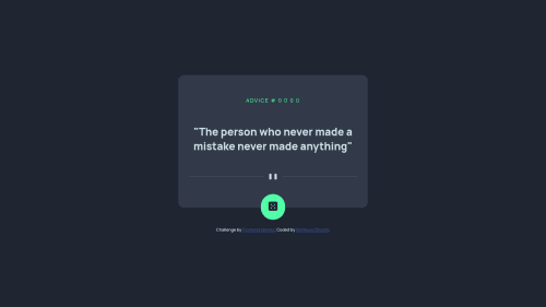
Submitted over 3 years agoA solution to the Advice generator app challenge
Created using flexbox and fetch for API
@matebeing

Solution retrospective
Feedback welcome + some help
I found really hard to create a responsive design, I ran out of time and I couldn't find an way to create it, so, I am feeling really upset. Plus, I don't think I had really good practices, I feel like the css selectors names are not well declared and my HTML structure is not concise.
Code
Loading...
Please log in to post a comment
Log in with GitHubCommunity feedback
No feedback yet. Be the first to give feedback on Matheus Oliveira's solution.
Join our Discord community
Join thousands of Frontend Mentor community members taking the challenges, sharing resources, helping each other, and chatting about all things front-end!
Join our Discord