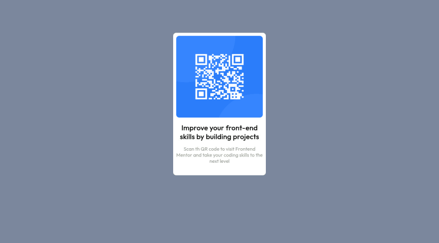
Design comparison
Solution retrospective
Just a single question. How to center a div?
Community feedback
- @NaveenGumastePosted about 3 years ago
Hay ! Good Job
These below mentioned tricks will help you remove any Accessibility Issues
-> Add Main tag after body like it should be your container
-> For 1st heading or h1 tag, use header tag and then inside the header put your h1 or h2 etc
-> But use header tag only once in main heading element.
Keep up the good work!
Marked as helpful1 - @rsrclabPosted about 3 years ago
Hi, @daksh514 ~
Congratulate on your solution to the challenge on FM platform. I have studied your work carefully and learned a lot from it.
Here are some of the tips I like to provide.
- Please try BEM for naming element classes. It will help you a lot on bigger projects.
- You can use media query for elements to look good on small devices.
display: flex; align-items: center;will make card being centered vertically.
If it can help you even a bit, it would be happy to me.
Cheers ~
Marked as helpful1 - @RioCantrePosted about 3 years ago
Hello there! Nice work with this one. Looking at your solution, I think you should considered the following as well...
- Adjust the background color into
background: hsla(223, 20%, 85%, 1); - Add
padding: 0 1rem;inside the.main_pararule set - Wrap
qr-bgwith specific tag likemainfor readability - Change the width of the
.qr-bginto 320px
To center a
divusemargin:autoOverall you did well and Keep it going! Cheers!
Marked as helpful1 - Adjust the background color into
Please log in to post a comment
Log in with GitHubJoin our Discord community
Join thousands of Frontend Mentor community members taking the challenges, sharing resources, helping each other, and chatting about all things front-end!
Join our Discord
