Submitted 10 months ago
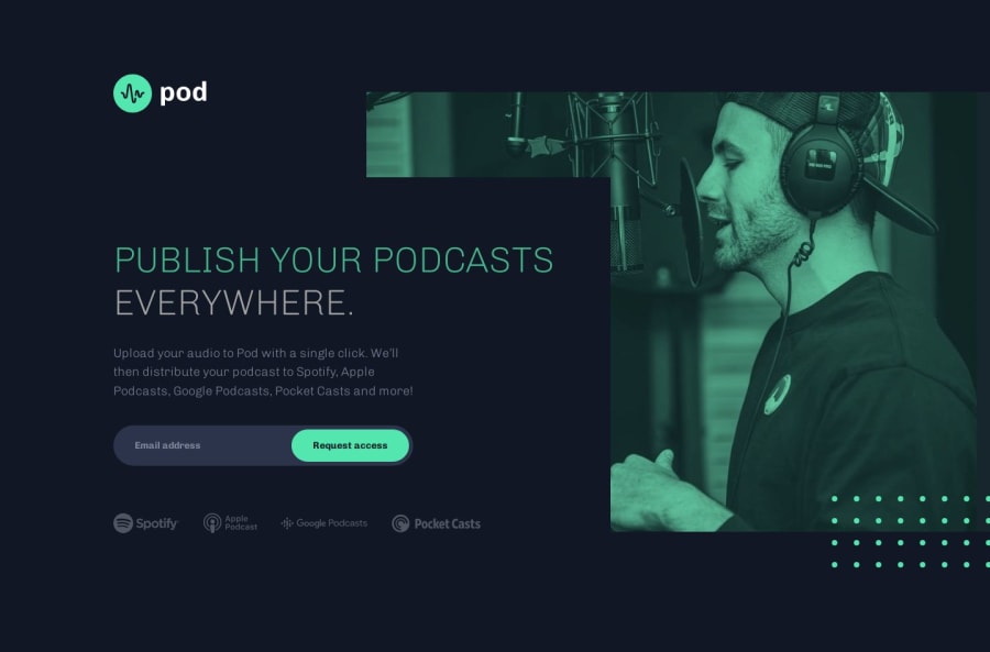
Created a responsive landing page using Grid, Flexbox, and JS
P
@MorganEro
Design comparison
SolutionDesign
Solution retrospective
What are you most proud of, and what would you do differently next time?
I am proud of my attention to detail. I wasn't satisfied till I found a way to duplicate the figma and preview files as closely as I could.
What challenges did you encounter, and how did you overcome them?I noticed that the font weight given in the figma files didnt visually match up to the weight used in the previews and figma images. I had to use other weights to better match the designs.
Community feedback
Please log in to post a comment
Log in with GitHubJoin our Discord community
Join thousands of Frontend Mentor community members taking the challenges, sharing resources, helping each other, and chatting about all things front-end!
Join our Discord
