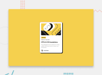
Design comparison
Solution retrospective
It took me a second to figure out all the positioning, especially since this is my first project using flex. I would like to organize my code better next time at least, I felt kinda all over the place.
What challenges did you encounter, and how did you overcome them?I had a hard time getting the main image fitting into the main container. I was able to figure it out with trial and error. It was also a great learning experience with flex.
What specific areas of your project would you like help with?When it comes to basic HTML and CSS I feel I'm pretty proficient. I just need to work on responsiveness and flexbox/grid. Overall, if anyone has any suggestions I am open to learning more!
Community feedback
- @yess-vzoPosted 5 months ago
It is very similar to the original but it is not the same. When dealing with text size, in this case you can use the image as a point of reference to guide you. If you see, the date ends up being much larger than the original design, likewise the author's name and his image are slightly larger and do not have a top margin that gives it additional separation.
0
Please log in to post a comment
Log in with GitHubJoin our Discord community
Join thousands of Frontend Mentor community members taking the challenges, sharing resources, helping each other, and chatting about all things front-end!
Join our Discord

