Creación de Tarjeta - CSS y HTML (Implementación de flexbox)


Design comparison

Community feedback
- @MelvinAguilarPosted about 2 years ago
Hola @GatiMhersi 👋, ¡Buen trabajo al completar este desafío! 🎉
Tengo algunas sugerencias que podría considerar para mejorar su código:
- Use la etiqueta
<main>para incluir todo el contenido principal en su solución. en lugar de usar<div class="container">.
- Use
<footer>en lugar de<div class="attribution">. El elemento<footer>contiene información de autoría.
- Puede usar una etiqueta <picture> cuando necesite cambiar una imagen en diferentes dimensiones. El uso de esta etiqueta evitará que el navegador cargue ambas imágenes, lo que ahorrará ancho de banda y evitará que utilice un "media query" en su archivo CSS para modificar la imagen.
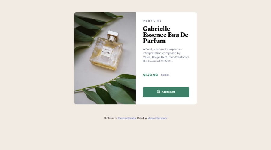
<picture> <source media="(max-width: 700px)" srcset="./images/image-product-mobile.jpg"> <img src="./images/image-product-desktop.jpg" alt="your_alt_text"> </picture>- Puede usar la etiqueta <del> para mostrar el precio anterior:
<del class="old-price">
   <span class="sr-only">Old price: </span>$169.99
</del>
Tenga en cuenta que agregué un <span> con la clase
sr-onlyal elementodel, esto proporcionará más información sobre el precio anterior a los lectores de pantalla.La clase
sr-onlyes una clase que puede agregar para ocultar contenido visualmente, pero solo es visible para lectores de pantalla.¡Espero que esos consejos le ayuden! 👍
¡Buen trabajo! 😁
Marked as helpful2 - Use la etiqueta
- @correlucasPosted about 2 years ago
👾Hello @GatiMhersi, Congratulations on completing this challenge!
Your solution its almost done and I’ve some tips to help you to improve it:
Use the THE PICTURE TAG that is a shortcut to deal with the multiple images in this challenge. So you can use the
<picture>tag instead of importing this as an<img>or using a div withbackground-image. Use it to place the images and make the change between mobile and desktop, instead of using adivorimgand set the change in the css withdisplay: nonewith the tag picture is more practical and easy. Note that for SEO / search engine reasons isn’t a better practice import this product image with CSS since this will make it harder to the image. Manage both images inside the<picture>tag and use the html to code to set when the images should change setting the devicemax-widthdepending of the device desktop + mobile.Check the link for the official documentation for
<picture>in W3 SCHOOLS:https://www.w3schools.com/tags/tag_picture.aspSee the example below:
<picture> <source media="(max-width:650px)" srcset="./images/image-product-mobile.jpg"> <img src="./images/image-product-desktop.jpg" alt="Gabrielle Parfum" style="width:auto;"> </picture>👨💻Here's my solution for this challenge if you wants to see how I build it: https://www.frontendmentor.io/solutions/product-preview-card-vanilla-css-and-custom-hover-state-on-hero-dVGWpOTgWS
✌️ I hope this helps you and happy coding!
Marked as helpful1


Please log in to post a comment
Log in with GitHub
Join our Discord community
Join thousands of Frontend Mentor community members taking the challenges, sharing resources, helping each other, and chatting about all things front-end!
Join our Discord