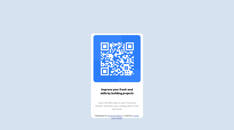
Design comparison
Solution retrospective
A great one, because I figured out some things.
The problem is that I haven't respected the rules of the challenge. Instead of using the QR code image provided I have created the QR code image using Grid container and Grid items. :D:D:D:D:D
I knew that I had to create a lot of divs and here is when I called ChatGPT. Asked it how to create a lot of divs with a short code (please notice I know very basic JS learnt 2 years ago). And it gave me a short script that came perfectly.
Also, I have even created those two circles inside the container of the code.
The problem I have with the project and what I don't like is that I am bad at centering. Finally did something but I am not pretty sure if it is ok. Somehow I have some centering. The responsiveness is pretty poor.
For me the project was about creating the QR code. Sorry :D:D
Thank you for reading!
Community feedback
- @visualdennissPosted over 1 year ago
Haha very original approach!
Here is a great tool to create css grids simply by clicking on squares and it gives u the code already: https://cssgrid-generator.netlify.app/ So it might be useful in case you need to create another QR Code in the future :D
Marked as helpful1@LucianIoan31Posted over 1 year ago@visualdenniss Cool app. I needed 841 grid-items in order to create the code:))
0 - @Biseq12Posted over 1 year ago
Good job completing the project! I found it very funny because it's unique, congrats !
"The problem I have with the project and what I don't like is that I am bad at centering"
. Let me tell you my style of centering a div and I hope you will understand how to center it.<main class = "container"> <div class="box"> </div> </main>
In this case, you will center the CONTAINER and the styling for BOX.
.container{ display: grid; justify-content: center; } .box{ width: 100px; height: 100px; background-color: black; }
An alternative for grid is flex, and you use it like this:
.container{ display:flex; justify-content: center; align-items: center; }
"The responsiveness is pretty poor."
.For this, you could learn some Bootstrap and it's the best for Responsive Sites.
Also, you could change the first div
<div class="container">
to<main class = "container">
for better semantic.I hope this will help you in your journey! Te salut :)
Marked as helpful0
Please log in to post a comment
Log in with GitHubJoin our Discord community
Join thousands of Frontend Mentor community members taking the challenges, sharing resources, helping each other, and chatting about all things front-end!
Join our Discord