Submitted 9 months ago
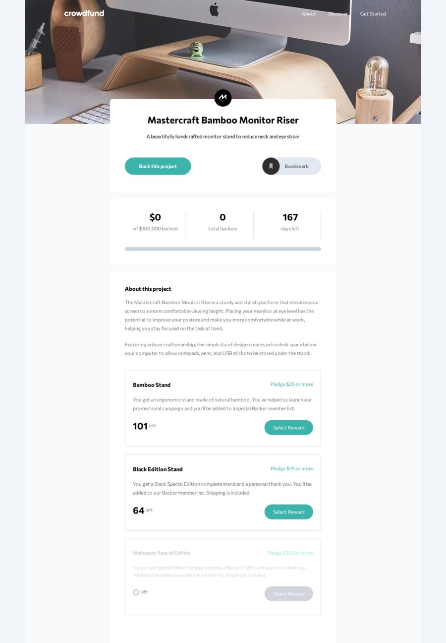
Cowdfunding product page with React and Tailwind CSS
#react#tailwind-css#vite
P
@memominguez
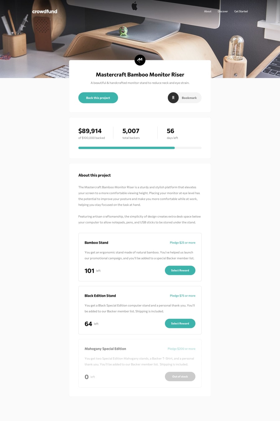
Design comparison
SolutionDesign
Solution retrospective
What are you most proud of, and what would you do differently next time?
Particular features are:
- Modal display, with create portal
- Responsive navbar, with Tailwind CSS
- Significant prop-drilling for handling the Modal
- In a challenge review, I would try a state management tool (there is more than one)
Somebody solved this challenge? Did you use a state management tool?
Community feedback
Please log in to post a comment
Log in with GitHubJoin our Discord community
Join thousands of Frontend Mentor community members taking the challenges, sharing resources, helping each other, and chatting about all things front-end!
Join our Discord
