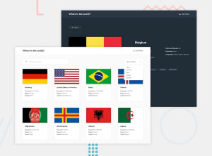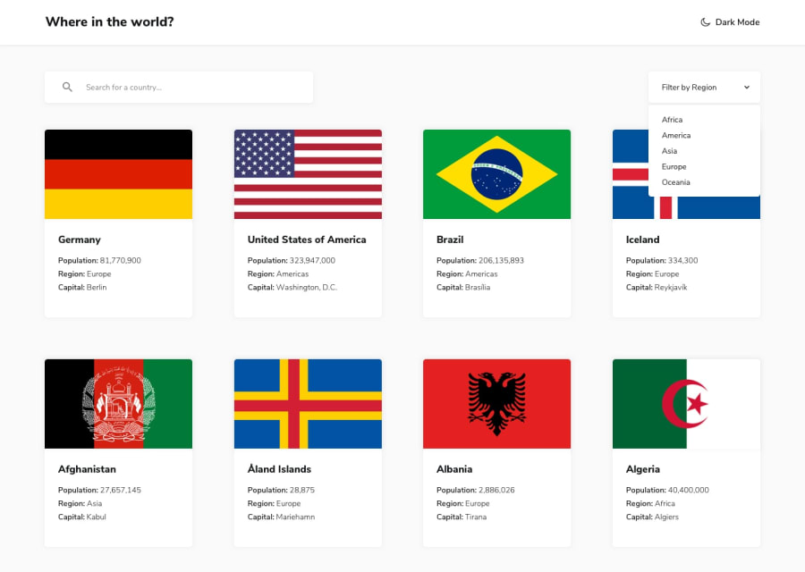
Country Rest API with React, NextJS, Framer Motion, MaterialUI...
Design comparison
Solution retrospective
This is my solution. Please if there is anything wrong or not good enough let me know. Thanks!
Community feedback
- @clarencejuluPosted almost 3 years ago
Hi Nathan, Firstly, great work on this project. I really like the 'up-down' animation you added on the first load.
However, I did identify two minor issues:
-
Border Countries - Your 'border countries buttons' navigate perfectly, but if you want to show the country's full name on each button, you can do the following,
for(let index = 0; index < countries.length; index++){ if(countries[index].alpha3Code === border){ country = countries[index]; break; } }
Here 'countries' is an array of all the countries generated from the API, while border was passed in as a prop into the current component this loop is in.
- Responsiveness - The responsiveness of your project is great in general but the header( the part which contains 'where in the world' and 'dark mode' ) could do with a little work. I think you should reduce the font-size value when the screen width is reduced so it looks good on smaller screens. Then when the width of the window is at 599px and below, the countries look stretchy. I think you should allow two countries to be on the same line here.
GoodLuck!
Marked as helpful1 -
- @NathLowePosted almost 3 years ago
Thank you very much for this very helpful comment of work.
1
Please log in to post a comment
Log in with GitHubJoin our Discord community
Join thousands of Frontend Mentor community members taking the challenges, sharing resources, helping each other, and chatting about all things front-end!
Join our Discord
