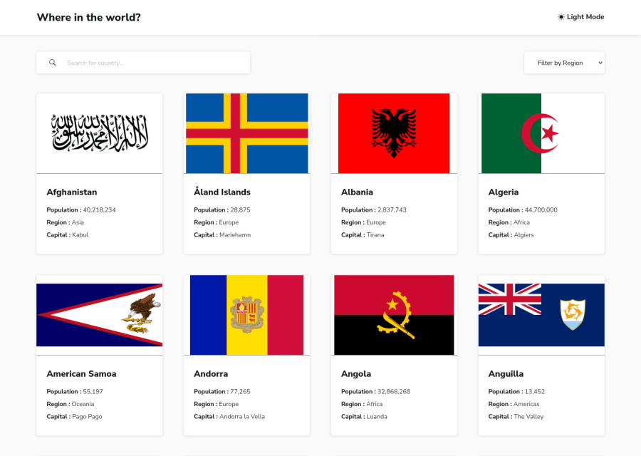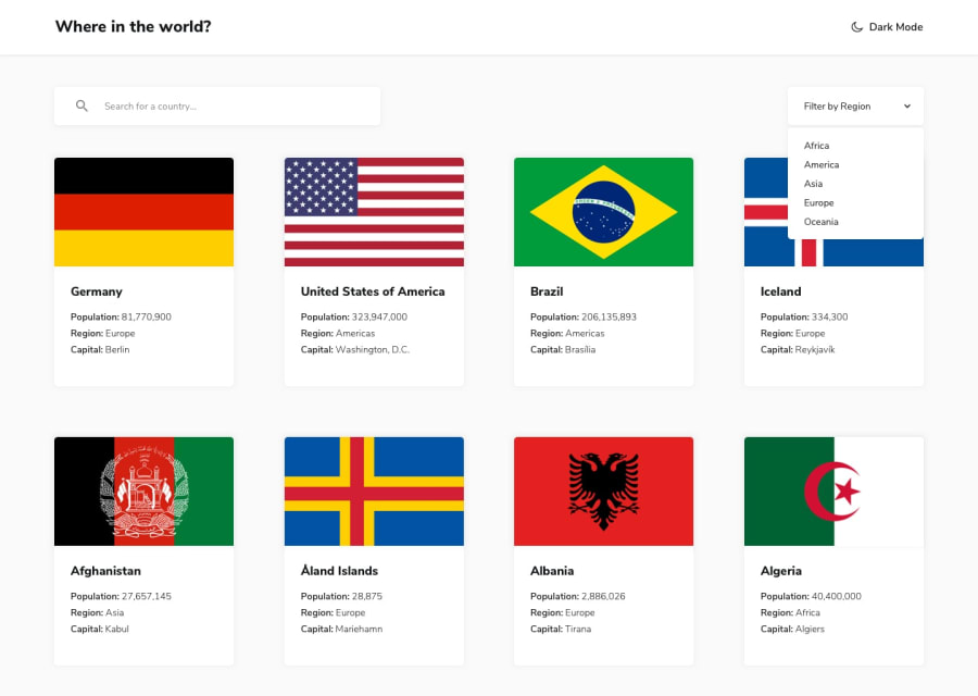
Country List Web App using Next.js + useSWR
Design comparison
Community feedback
- @ExploryKodPosted over 2 years ago
Well done. I loved using your website. I liked the well done dark mode. From a UI point of view, I liked the UI except may be the button to reset: it a personal point of view but I though it would have been better to align its size to the other button because both are from the same group and also give it a "sharper" red as color. Otherwise I find your code very interesting for beginner like me as I can learn a lot from it. I find Next js is a very good choice to "empacked" back and front end. It is a very good challenge, I think I'll do it too to try axios as I only use it once until now.
Happy coding.
Marked as helpful1@cholis04Posted over 2 years ago@ExploryKod That's a good idea, I'll try to align the size of the reset button with the other buttons and maybe change the color a bit to make it look 'sharp'.
I love hearing feedback from you.
Thanks for looking at my code,
1 - @jkellermanPosted about 3 years ago
Well Done, this is very nice 👌
0 - @olisa187Posted about 3 years ago
@Nurcholis Nice one love your output. still trying to get this level where I can build web pages like this. You are such an inspiration to me.
0@cholis04Posted about 3 years ago@olisa187 I try to keep learning some new things. I'm sure you can do it. Stay focus. Happy coding! 👍
1
Please log in to post a comment
Log in with GitHubJoin our Discord community
Join thousands of Frontend Mentor community members taking the challenges, sharing resources, helping each other, and chatting about all things front-end!
Join our Discord
