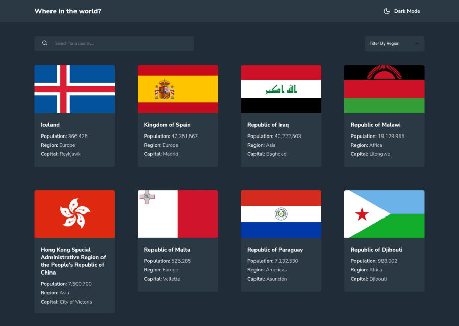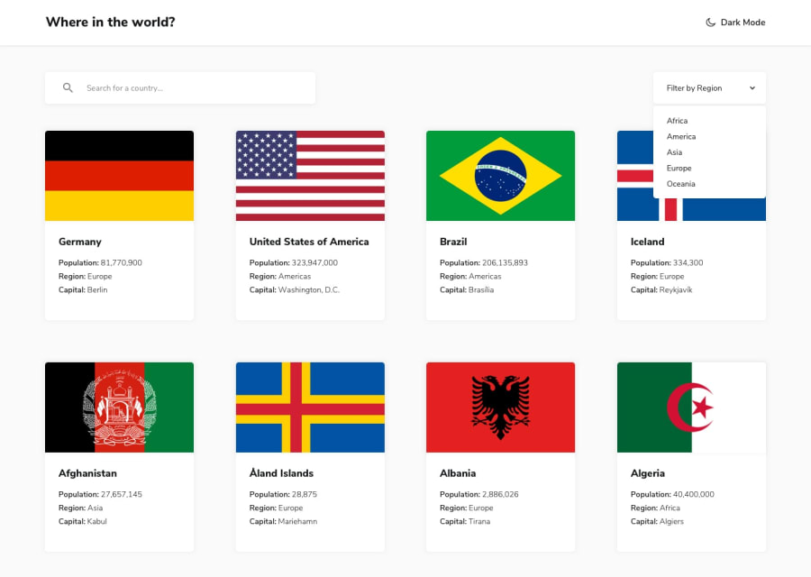
Design comparison
Solution retrospective
This is my second react solution, if there are any issues or ways to make the code more efficient or accessible.
Community feedback
- @Stephen-AdomPosted about 2 years ago
Hello shikoto, the height of your card grid must be of the same height. You can do that by setting the height of the card to 100% and add margin to the column sections. Also the image icon on the back button is not rendering On the view section, the should be some padding for the border countries list to be full display. You can increase the padding around the border countries label and add flex-wrap to the list if it overflows
Marked as helpful1 - @Cyrus-Akwaboah-EmmanuelPosted about 2 years ago
I haven't reached this level yet but this is really good. The smooth transition of the background theme is cool. I jus had a problem searching a country. I hope you fix it.
Overall, 💖👌
1
Please log in to post a comment
Log in with GitHubJoin our Discord community
Join thousands of Frontend Mentor community members taking the challenges, sharing resources, helping each other, and chatting about all things front-end!
Join our Discord
