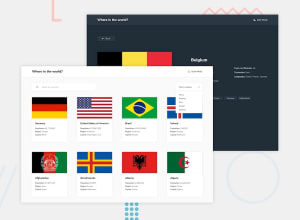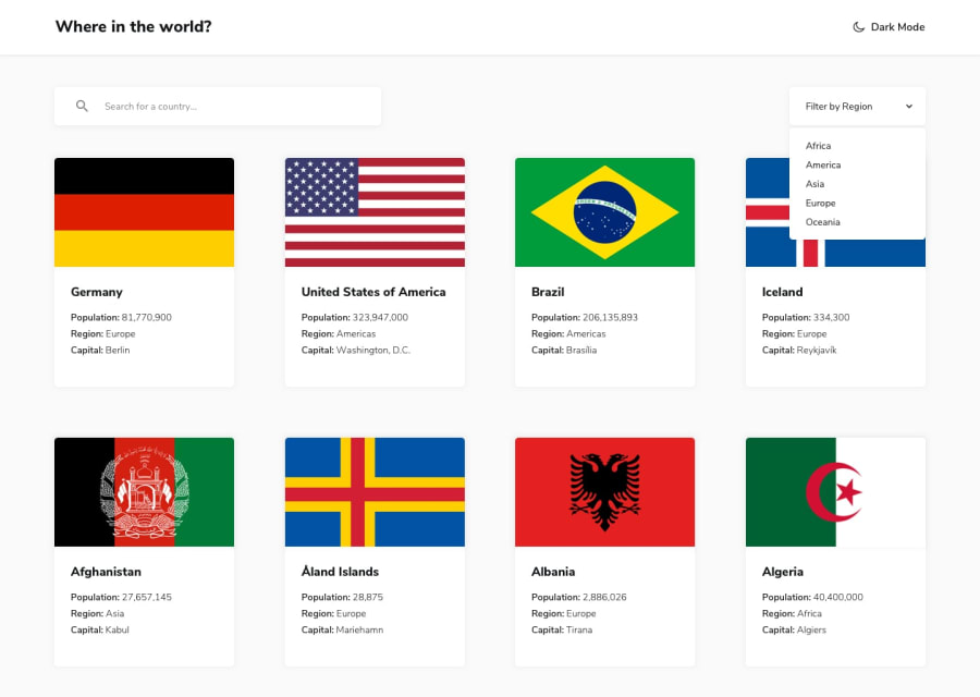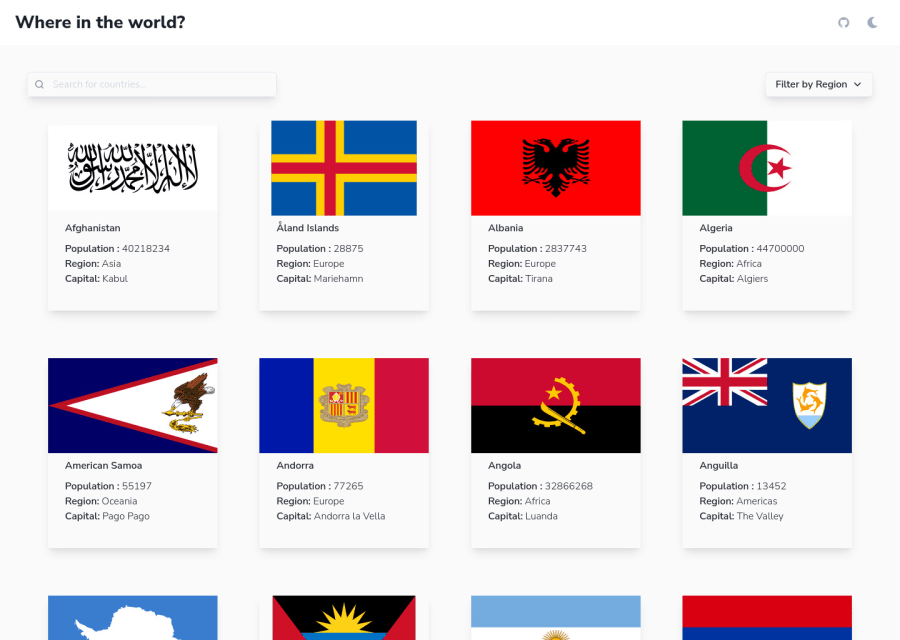
Design comparison
SolutionDesign
Solution retrospective
If you can spare a bit of your precious time to give me a feedback it would be awesome. If not, that's ok too. I'm glad that you're here.
Community feedback
- @denieldenPosted over 2 years ago
Hi Yago, great work on this challenge!
Here are a few tips for improve your code:
- add
main
tag and wrap the card for improve the Accessibility img
element must have analt
attribute, it's very important!- remove all unnecessary code, the less you write the better as well as being clearer: for example the
div
container of image - to make it look as close to the design as possible add the second color of background to
div
of card and addborder-radius: .5rem and overflow: hidden
- to make all flag images the same height use the
object-fit: cover
property toimg
element - instead of using
px
use relative units of measurement likerem
-> read here - if you want to use the title for the
href
attribute you have to parse it inurl
, it can give problems creating links with empty spaces or special characters - if I type a query that doesn't give any results, nothing happens, try adding a "no results" message
- I would also add a query reset button, I find it very convenient
- for the name of country use
h2
instead simplep
because it's the title of card - you can use
ul
instead of multiplep
for the details of country - in the details page the Border Countries isen't align horizontally
Overall you did well 😉
Hope this help and happy coding!
Marked as helpful0 - add
Please log in to post a comment
Log in with GitHubJoin our Discord community
Join thousands of Frontend Mentor community members taking the challenges, sharing resources, helping each other, and chatting about all things front-end!
Join our Discord